Bootstrap使用教程
1.简介
Bootstrap是全球最受欢迎的前端组件库,用于开发响应式布局、移动设备优先的Web项目。
- 官方网站:https://getbootstrap.com/
- 官方文档:https://getbootstrap.com/docs/4.1/getting-started/introduction/
- 官方示例:https://getbootstrap.com/docs/4.1/examples/
- Bootstrap中文网:https://www.bootcss.com/
- 参考教程:https://www.runoob.com/bootstrap4/bootstrap4-tutorial.html
- HTML在线工具:https://c.runoob.com/front-end/61 (也可以直接在本地创建HTML文件)
2.安装使用
方式一:从官网下载css和js文件
方式二(推荐):使用CDN
在<head>标签中增加以下内容:
1
2
3
4
5
6
7
8
9
10
11
12
13
14
<!-- 移动设备优先 -->
<meta name="viewport" content="width=device-width, initial-scale=1, shrink-to-fit=no">

<!-- Bootstrap4核心CSS文件 -->
<link rel="stylesheet" href="https://cdn.staticfile.org/twitter-bootstrap/4.3.1/css/bootstrap.min.css">

<!-- jQuery文件,务必在bootstrap.min.js之前引入 -->
<script src="https://cdn.staticfile.org/jquery/3.2.1/jquery.min.js"></script>

<!-- 用于弹窗、提示、下拉菜单 -->
<script src="https://cdn.staticfile.org/popper.js/1.15.0/umd/popper.min.js"></script>

<!-- Bootstrap核心JavaScript文件 -->
<script src="https://cdn.staticfile.org/twitter-bootstrap/4.3.1/js/bootstrap.min.js"></script>
2.1 创建第一个Bootstrap页面
1
2
3
4
5
6
7
8
9
10
11
12
13
14
15
16
17
18
19
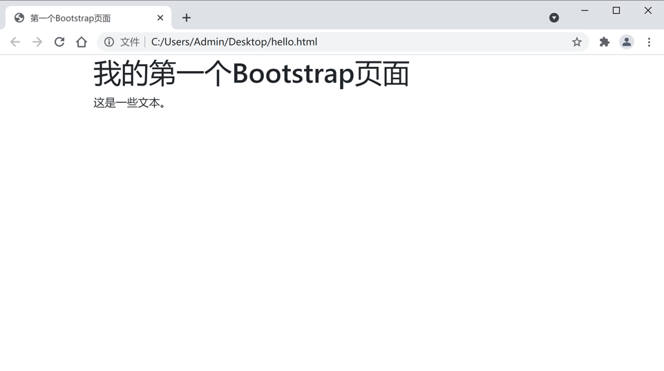
<!DOCTYPE html>
<html lang="zh">
<head>
<meta charset="UTF-8">
<title>第一个Bootstrap页面</title>
<meta name="viewport" content="width=device-width, initial-scale=1, shrink-to-fit=no">
<link rel="stylesheet" href="https://cdn.staticfile.org/twitter-bootstrap/4.3.1/css/bootstrap.min.css">
<script src="https://cdn.staticfile.org/jquery/3.2.1/jquery.min.js"></script>
<script src="https://cdn.staticfile.org/popper.js/1.15.0/umd/popper.min.js"></script>
<script src="https://cdn.staticfile.org/twitter-bootstrap/4.3.1/js/bootstrap.min.js"></script>
</head>
<body>
<div class="container">
<h1>我的第一个Bootstrap页面</h1>
<p>这是一些文本。</p>
</div>
</body>
</html>
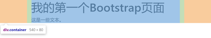
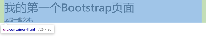
2.2 容器类
Bootstrap需要一个容器元素来包裹网站的内容。可以使用以下两个容器类:
.container:用于固定宽度并支持响应式布局的容器.container-fluid:用于100%宽度,占据全部视口(viewport)的容器
3.网格系统
官方文档:https://getbootstrap.com/docs/4.1/layout/grid/
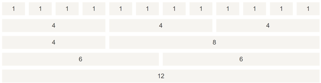
Bootstrap提供了一套网格系统,随着屏幕尺寸的增加,自动分为最多12列,也可以自定义列数。
Bootstrap的网格是响应式的,列会根据屏幕大小自动重新排列。
3.1 网格类
网格系统使用.row类表示一行,一行包含多个列。
.col-{screen}-{n}类表示一列(一个单元格),其中screen表示设备的屏幕大小,有5种类型:
sm:小,屏幕宽度≥576pxmd:中,屏幕宽度≥768pxlg:大,屏幕宽度≥992pxxl:超大,屏幕宽度≥1200px- 省略:即
.col-{n},针对所有设备
n控制单元格的宽度
- 1~12之间的整数:表示该单元格跨越多少列
auto:表示由内容宽度决定- 省略:即
.col,表示根据剩余空间自动设置为等宽
3.2 网格系统规则
- 每一行需要放置在设置了
.container或.container-fluid类的容器中 - 使用
.row创建行:<div class="row"> - 使用
.col创建列:<div class="col"> - 内容放置在列中,只有列可以是行的直接子节点
3.3 示例
为了便于观察,下面的示例给列增加了底色。截图图片的宽度就是浏览器窗口宽度。“电脑端”和“手机端”的区别就是屏幕宽度,通过调整浏览器窗口宽度模拟移动设备。
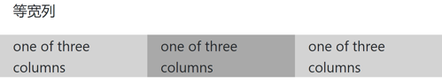
3.3.1 等宽列
直接使用.col类,则同一行的列宽度相等。
1
2
3
4
5
6
7
8
<div class="container">
    <p>等宽列</p>
    <div class="row">
        <div class="col" style="background-color: lightgray">one of three columns</div>
        <div class="col" style="background-color: darkgray">one of three columns</div>
        <div class="col" style="background-color: lightgray">one of three columns</div>
    </div>
</div>
电脑端:

手机端:
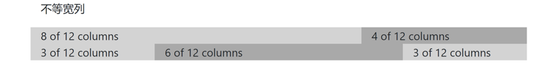
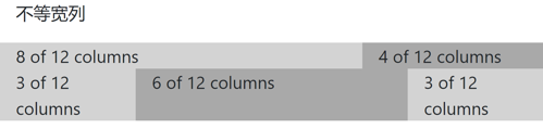
3.3.2 不等宽列
通过显式指定col后的数字实现,同一行的数字之和应为12。如果有些列指定了数字、有些未指定,则未指定的列自动设置为剩余空间等宽。
1
2
3
4
5
6
7
8
9
10
11
12
<div class="container">
    <p>不等宽列</p>
    <div class="row">
        <div class="col-8" style="background-color: lightgray">8 of 12 columns</div>
        <div class="col-4" style="background-color: darkgray">4 of 12 columns</div>
    </div>
    <div class="row">
        <div class="col" style="background-color: lightgray">3 of 12 columns</div>
        <div class="col-6" style="background-color: darkgray">6 of 12 columns</div>
        <div class="col" style="background-color: lightgray">3 of 12 columns</div>
    </div>
</div>
电脑端:
手机端:
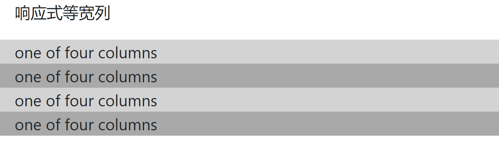
3.3.3 响应式等宽列
“响应式”是指在不同屏幕宽度的设备上显示不同的样式,通过指定col后的屏幕类型和数字实现。
下面的示例在屏幕宽度≥576px时显示为四个等宽列,在屏幕宽度<576px(例如移动设备)时显示为上下堆叠。
1
2
3
4
5
6
7
8
9
<div class="container">
    <p>响应式等宽列</p>
    <div class="row">
        <div class="col-sm-3" style="background-color: lightgray">one of four columns</div>
        <div class="col-sm-3" style="background-color: darkgray">one of four columns</div>
        <div class="col-sm-3" style="background-color: lightgray">one of four columns</div>
        <div class="col-sm-3" style="background-color: darkgray">one of four columns</div>
    </div>
</div>
电脑端:

手机端:
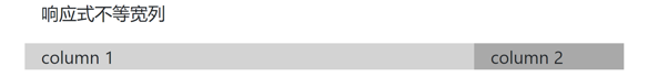
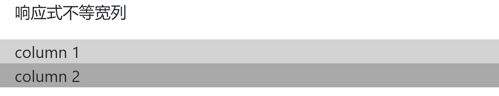
3.3.4 响应式不等宽列
下面的示例在中等及以上屏幕(宽度≥768px,例如电脑)显示为3:1的两列,在小屏幕(576px≤宽度<768px,例如平板)显示为1:1的两列,在超小屏幕(宽度<576px,例如手机)显示为上下堆叠。
1
2
3
4
5
6
7
<div class="container">
    <p>响应式不等宽列</p>
    <div class="row">
        <div class="col-sm-6 col-md-9" style="background-color: lightgray">column 1</div>
        <div class="col-sm-6 col-md-3" style="background-color: darkgray">column 2</div>
    </div>
</div>
电脑端:

平板:
手机端:
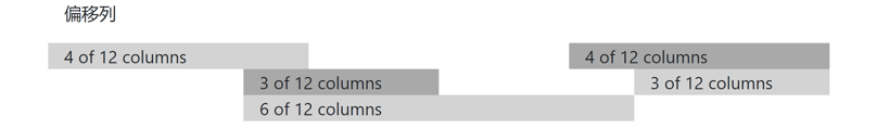
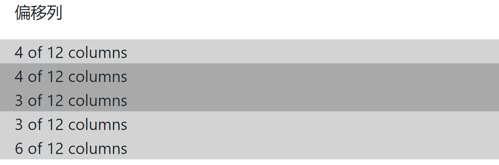
3.3.5 偏移列
偏移列通过.offset-<screen>-<n>类来设置,表示当屏幕宽度大于等于指定的类型时将该单元格偏移n列,screen同col,n是1~11之间的整数。
1
2
3
4
5
6
7
8
9
10
11
12
13
14
<div class="container">
    <p>偏移列</p>
    <div class="row">
        <div class="col-sm-4" style="background-color: lightgray">4 of 12 columns</div>
        <div class="col-sm-4 offset-sm-4" style="background-color: darkgray">4 of 12 columns</div>
    </div>
    <div class="row">
        <div class="col-sm-3 offset-sm-3" style="background-color: darkgray">3 of 12 columns</div>
        <div class="col-sm-3 offset-sm-3" style="background-color: lightgray">3 of 12 columns</div>
    </div>
    <div class="row">
        <div class="col-sm-6 offset-sm-3" style="background-color: lightgray">6 of 12 columns</div>
    </div>
</div>
电脑端:
手机端:
4.文字排版
官方文档:
- https://getbootstrap.com/docs/4.1/content/typography/
- https://getbootstrap.com/docs/4.1/utilities/text/
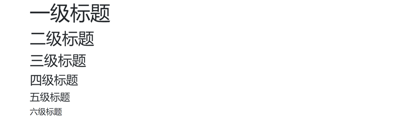
4.1 标题
使用<h1>~<h6>元素显示一到六级标题(这是HTML本身的标签,但Bootstrap为其定义了样式,因此与默认样式有区别,下同)。
1
2
3
4
5
6
<h1>一级标题</h1>
<h2>二级标题</h2>
<h3>三级标题</h3>
<h4>四级标题</h4>
<h5>五级标题</h5>
<h6>六级标题</h6>
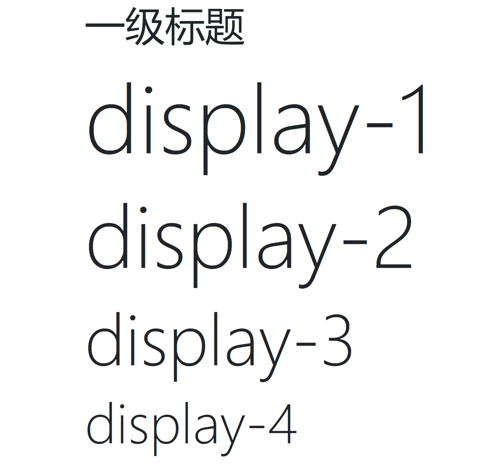
4.2 display标题
Bootstrap提供了四个标题类.display-{1~4},用于显示更大的标题样式。
1
2
3
4
5
<h1>一级标题</h1>
<h1 class="display-1">display-1</h1>
<h1 class="display-2">display-2</h1>
<h1 class="display-3">display-3</h1>
<h1 class="display-4">display-4</h1>
4.3 小文本
使用<small>元素创建字号更小的文本。
1
2
<h1>标题 <small>副标题</small></h1>
<p>正常文本 <small>小文本</small></p>

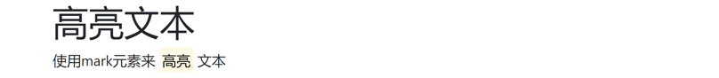
4.4 高亮文本
使用<mark>元素高亮文本。
1
2
<h1>高亮文本</h1>
<p>使用mark元素来 <mark>高亮</mark> 文本</p>
4.5 缩略语
使用<abbr>元素显示缩写/缩略语。
1
2
<h1>缩略语</h1>
<p>The <abbr title="World Health Organization">WHO</abbr> was founded in 1948.</p>

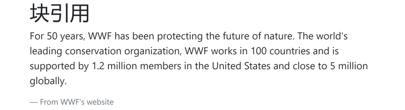
4.6 块引用
使用<blockquote>元素显示引用的内容。
1
2
3
4
5
<h1>块引用</h1>
<blockquote class="blockquote">
    <p>For 50 years, WWF has been protecting the future of nature. The world's leading conservation organization, WWF works in 100 countries and is supported by 1.2 million members in the United States and close to 5 million globally.</p>
    <footer class="blockquote-footer">From WWF's website</footer>
</blockquote>
4.7 代码
使用<code>元素显示代码。
1
2
<h1>代码</h1>
<p>在Python中,<code>int()</code>是向零取整,<code>math.floor()</code>是向下取整</p>

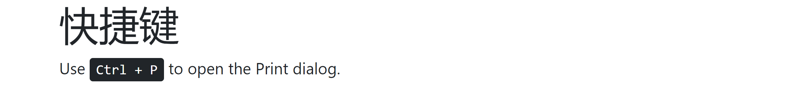
4.8 快捷键
使用<kbd>元素显示键盘快捷键。
1
2
<h1>快捷键</h1>
<p>Use <kbd>Ctrl + P</kbd> to open the Print dialog.</p>
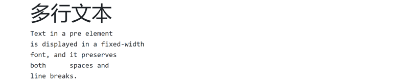
4.9 多行文本
使用<pre>元素显示多行文本,文本将显示为等宽字体,空格和换行将被保留。
1
2
3
4
5
6
<h1>多行文本</h1>
<pre>Text in a pre element
is displayed in a fixed-width
font, and it preserves
both      spaces and
line breaks.</pre>
4.10 更多排版类
| 类 | 描述 |
|---|---|
.font-weight-bold | 加粗 |
.font-weight-normal | 普通 |
.font-weight-light | 更细 |
.font-italic | 斜体 |
.lead | 让段落更突出 |
.small | 文本更小 |
.text-left | 左对齐 |
.text-center | 居中 |
.text-right | 右对齐 |
.text-justify | 自动换行 |
.text-nowrap | 不自动换行 |
.text-lowercase | 全部小写 |
.text-uppercase | 全部大写 |
.text-capitalize | 单词首字母大写 |
5.颜色
官方文档:https://getbootstrap.com/docs/4.1/utilities/colors/
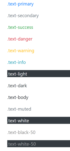
5.1 文本颜色
使用.text-{color}类设置文本颜色。这些类可用于<p>和<a>标签。
1
2
3
4
5
6
7
8
9
10
11
12
13
<p class="text-primary">.text-primary</p>
<p class="text-secondary">.text-secondary</p>
<p class="text-success">.text-success</p>
<p class="text-danger">.text-danger</p>
<p class="text-warning">.text-warning</p>
<p class="text-info">.text-info</p>
<p class="text-light bg-dark">.text-light</p>
<p class="text-dark">.text-dark</p>
<p class="text-body">.text-body</p>
<p class="text-muted">.text-muted</p>
<p class="text-white bg-dark">.text-white</p>
<p class="text-black-50">.text-black-50</p>
<p class="text-white-50 bg-dark">.text-white-50</p>
(黑色背景是手动设置)
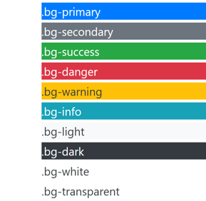
5.2 背景颜色
使用.bg-{color}类设置背景颜色。这些类可用于<div>标签,注意背景色不设置文字颜色。
1
2
3
4
5
6
7
8
9
10
<div class="bg-primary text-white my-1">.bg-primary</div>
<div class="bg-secondary text-white my-1">.bg-secondary</div>
<div class="bg-success text-white my-1">.bg-success</div>
<div class="bg-danger text-white my-1">.bg-danger</div>
<div class="bg-warning text-dark my-1">.bg-warning</div>
<div class="bg-info text-white my-1">.bg-info</div>
<div class="bg-light text-dark my-1">.bg-light</div>
<div class="bg-dark text-white my-1">.bg-dark</div>
<div class="bg-white text-dark my-1">.bg-white</div>
<div class="bg-transparent text-dark my-1">.bg-transparent</div>
(白色文字是手动设置)
6.表格
官方文档:https://getbootstrap.com/docs/4.1/content/tables/
6.1 基础表格
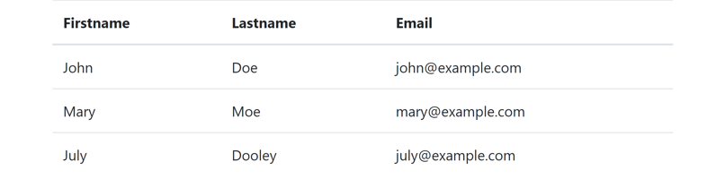
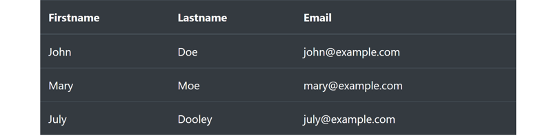
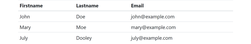
Bootstrap通过.table类来设置基础表格的样式。
1
2
3
4
5
6
7
8
9
10
11
12
13
14
15
16
17
18
19
20
21
22
23
24
25
26
<table class="table">
    <thead>
    <tr>
        <th>Firstname</th>
        <th>Lastname</th>
        <th>Email</th>
    </tr>
    </thead>
    <tbody>
    <tr>
        <td>John</td>
        <td>Doe</td>
        <td>john@example.com</td>
    </tr>
    <tr>
        <td>Mary</td>
        <td>Moe</td>
        <td>mary@example.com</td>
    </tr>
    <tr>
        <td>July</td>
        <td>Dooley</td>
        <td>july@example.com</td>
    </tr>
    </tbody>
</table>
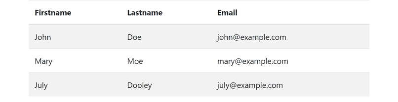
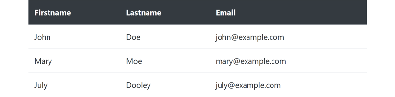
6.2 条纹表格
.table-striped类使<tbody>中的行显示条纹背景。
1
<table class="table table-striped">
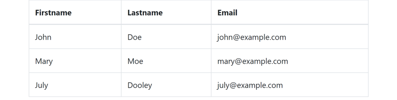
6.3 带边框表格
.table-bordered类为表格添加边框。
1
<table class="table table-bordered">
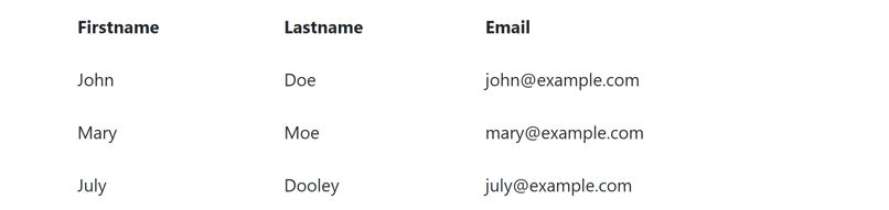
6.4 无边框表格
.table-borderless类使表格不显示边框。
1
<table class="table table-borderless">
6.5 鼠标悬停表格
.table-hover类为表格的每一行添加鼠标悬停效果(灰色背景)。
1
<table class="table table-hover">
6.6 黑色背景表格
.table-dark类为表格添加黑色背景。
1
<table class="table table-dark">
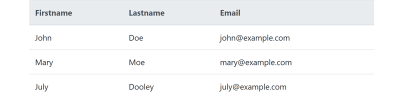
6.7 表头颜色
.thead-dark类给表头添加黑色背景,.thead-light类给表头添加灰色背景。
1
<thead class="thead-dark">
1
<thead class="thead-light">
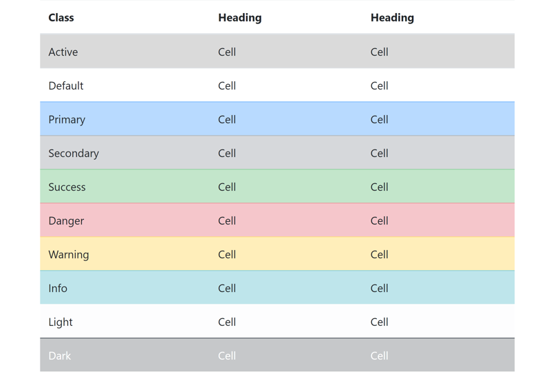
6.8 表格颜色
使用.table-{color}类可以为表格的单元格、行或整个表格指定颜色。这些类可用于<td>, <th>, <tr>或<table>标签。另外,背景颜色类.bg-{color}也可用于这些标签。
1
2
3
4
5
6
7
8
9
10
11
12
13
14
15
16
17
18
19
20
21
22
23
24
25
26
27
28
29
30
31
32
33
34
35
36
37
38
39
40
41
42
43
44
45
46
47
48
49
50
51
52
53
54
55
56
57
58
59
60
61
<table class="table">
    <thead>
    <tr>
        <th>Class</th>
        <th>Heading</th>
        <th>Heading</th>
    </tr>
    </thead>
    <tbody>
    <tr class="table-active">
        <td>Active</td>
        <td>Cell</td>
        <td>Cell</td>
    </tr>
    <tr>
        <td>Default</td>
        <td>Cell</td>
        <td>Cell</td>
    </tr>
    <tr class="table-primary">
        <td>Primary</td>
        <td>Cell</td>
        <td>Cell</td>
    </tr>
    <tr class="table-secondary">
        <td>Secondary</td>
        <td>Cell</td>
        <td>Cell</td>
    </tr>
    <tr class="table-success">
        <td>Success</td>
        <td>Cell</td>
        <td>Cell</td>
    </tr>
    <tr class="table-danger">
        <td>Danger</td>
        <td>Cell</td>
        <td>Cell</td>
    </tr>
    <tr class="table-warning">
        <td>Warning</td>
        <td>Cell</td>
        <td>Cell</td>
    </tr>
    <tr class="table-info">
        <td>Info</td>
        <td>Cell</td>
        <td>Cell</td>
    </tr>
    <tr class="table-light">
        <td>Light</td>
        <td>Cell</td>
        <td>Cell</td>
    </tr>
    <tr class="table-dark">
        <td>Dark</td>
        <td>Cell</td>
        <td>Cell</td>
    </tr>
    </tbody>
</table>
6.9 较小的表格
.table-sm类减少单元格的内边距(padding)。
1
<table class="table table-sm">
6.10 响应式表格
.table-responsive类用于创建响应式表格,当屏幕宽度较小时会显示水平滚动条。
1
2
3
4
5
6
7
8
9
10
11
12
13
14
15
16
17
18
19
20
21
22
23
24
25
26
27
28
29
30
31
32
33
34
35
36
37
38
39
40
41
42
43
44
45
46
47
48
49
50
<table class="table table-responsive">
    <thead>
    <tr>
        <th scope="col">Heading</th>
        <th scope="col">Heading</th>
        <th scope="col">Heading</th>
        <th scope="col">Heading</th>
        <th scope="col">Heading</th>
        <th scope="col">Heading</th>
        <th scope="col">Heading</th>
        <th scope="col">Heading</th>
        <th scope="col">Heading</th>
    </tr>
    </thead>
    <tbody>
    <tr>
        <td>Cell</td>
        <td>Cell</td>
        <td>Cell</td>
        <td>Cell</td>
        <td>Cell</td>
        <td>Cell</td>
        <td>Cell</td>
        <td>Cell</td>
        <td>Cell</td>
    </tr>
    <tr>
        <td>Cell</td>
        <td>Cell</td>
        <td>Cell</td>
        <td>Cell</td>
        <td>Cell</td>
        <td>Cell</td>
        <td>Cell</td>
        <td>Cell</td>
        <td>Cell</td>
    </tr>
    <tr>
        <td>Cell</td>
        <td>Cell</td>
        <td>Cell</td>
        <td>Cell</td>
        <td>Cell</td>
        <td>Cell</td>
        <td>Cell</td>
        <td>Cell</td>
        <td>Cell</td>
    </tr>
    </tbody>
</table>
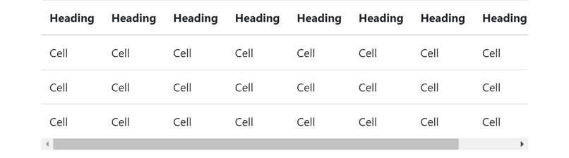
也可以使用.table-responsive-{sm|md|lg|xl}指定只有当屏幕宽度小于指定的类型(见“网格系统”)时显示水平滚动条,否则正常显示。
1
<table class="table table-responsive-sm">
电脑端(这里的滚动条是浏览器窗口的,不是表格的):
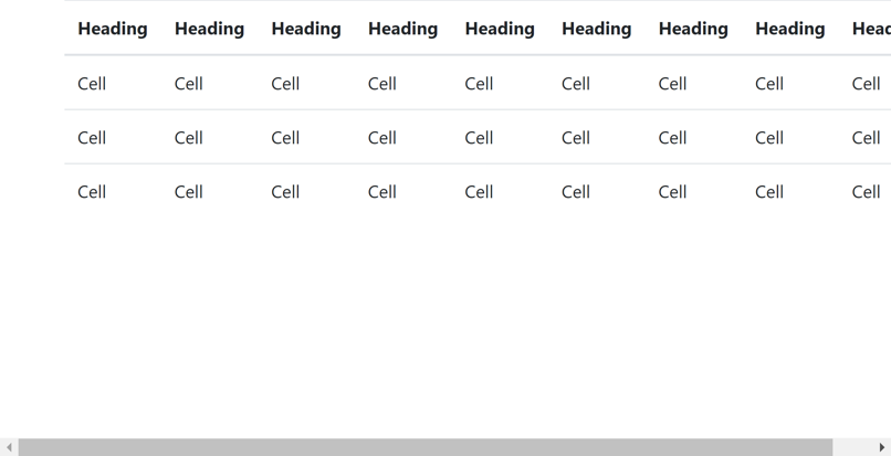
手机端:

7.图片
官方文档:https://getbootstrap.com/docs/4.1/content/images/
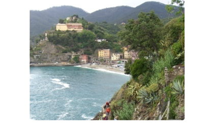
7.1 圆角图片
.rounded类让图片显示圆角效果。
1
<img src="https://static.runoob.com/images/mix/cinqueterre.jpg" class="rounded" alt="Cinque Terre">
7.2 椭圆图片
.rounded-circle类设置椭圆形图片。
1
<img src="https://static.runoob.com/images/mix/cinqueterre.jpg" class="rounded-circle" alt="Cinque Terre">
7.3 缩略图
.img-thumbnail类设置缩略图(给图片添加圆角边框)。
1
<img src="https://static.runoob.com/images/mix/cinqueterre.jpg" class="img-thumbnail" alt="Cinque Terre">
7.4 对齐方式
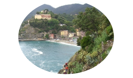
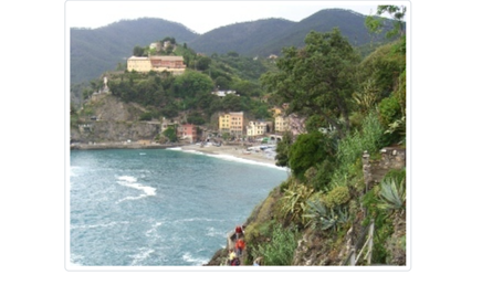
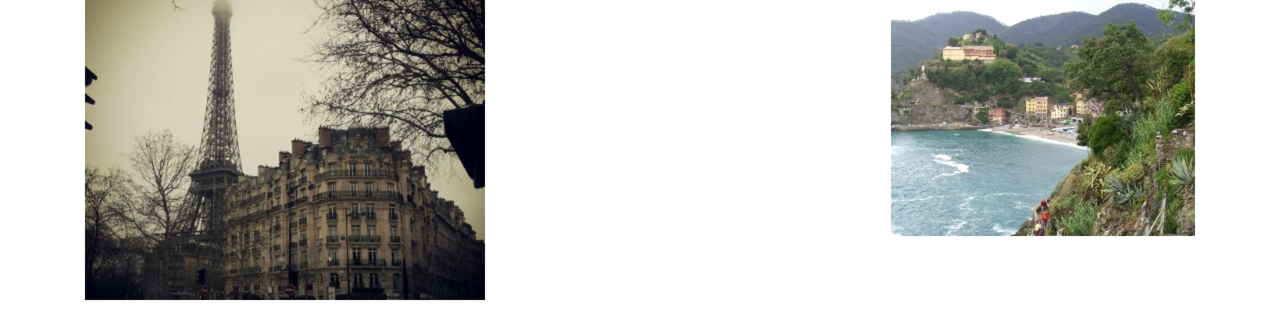
.float-left类设置图片左对齐,.float-right类设置图片右对齐。
1
2
<img src="https://static.runoob.com/images/mix/paris.jpg" class="float-left" alt="Paris">
<img src="https://static.runoob.com/images/mix/cinqueterre.jpg" class="float-right" alt="Cinque Terre">
7.5 响应式图片
.img-fluid类设置响应式图片,能够根据屏幕大小自动适应。
1
<img src="https://getbootstrap.com/docs/5.0/assets/img/bootstrap-icons@2x.png" class="img-fluid" alt="Bootstrap Icons">
电脑端:
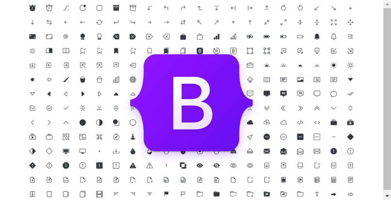
手机端:
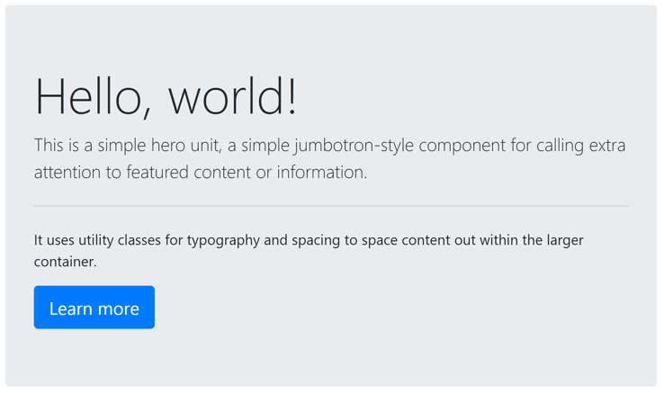
8.Jumbotron
官方文档:https://getbootstrap.com/docs/4.1/components/jumbotron/
Jumbotron(超大屏幕)会创建一个大的灰色背景框,里面可以放置一些特殊的内容和信息。
1
2
3
4
5
6
7
<div class="jumbotron">
    <h1 class="display-4">Hello, world!</h1>
    <p class="lead">This is a simple hero unit, a simple jumbotron-style component for calling extra attention to featured content or information.</p>
    <hr class="my-4">
    <p>It uses utility classes for typography and spacing to space content out within the larger container.</p>
    <a href="#" class="btn btn-primary btn-lg">Learn more</a>
</div>
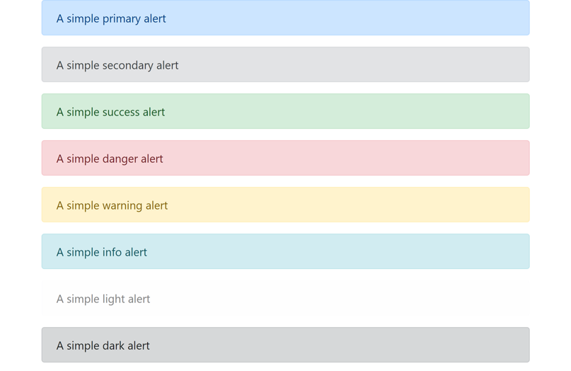
9.信息提示框
官方文档:https://getbootstrap.com/docs/4.1/components/alerts/
9.1 创建信息提示框
Bootstrap使用.alert加上.alert-{color}类实现信息提示框。
1
2
3
4
5
6
7
8
<div class="alert alert-primary">A simple primary alert</div>
<div class="alert alert-secondary">A simple secondary alert</div>
<div class="alert alert-success">A simple success alert</div>
<div class="alert alert-danger">A simple danger alert</div>
<div class="alert alert-warning">A simple warning alert</div>
<div class="alert alert-info">A simple info alert</div>
<div class="alert alert-light">A simple light alert</div>
<div class="alert alert-dark">A simple dark alert</div>
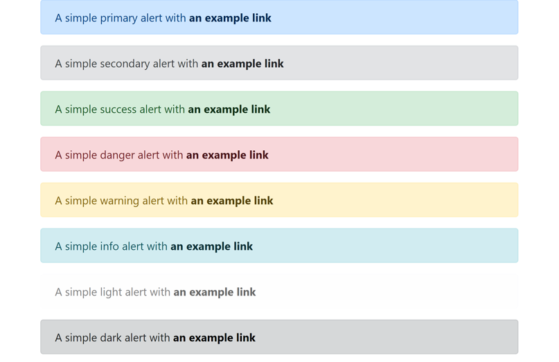
9.2 提示框链接
给提示框中的<a>标签添加.alert-link类来设置匹配提示框颜色的链接。
1
2
3
4
5
6
7
8
9
10
11
12
13
14
15
16
17
18
19
20
21
22
23
24
<div class="alert alert-primary">
    A simple primary alert with <a href="#" class="alert-link">an example link</a>
</div>
<div class="alert alert-secondary">
    A simple secondary alert with <a href="#" class="alert-link">an example link</a>
</div>
<div class="alert alert-success">
    A simple success alert with <a href="#" class="alert-link">an example link</a>
</div>
<div class="alert alert-danger">
    A simple danger alert with <a href="#" class="alert-link">an example link</a>
</div>
<div class="alert alert-warning">
    A simple warning alert with <a href="#" class="alert-link">an example link</a>
</div>
<div class="alert alert-info">
    A simple info alert with <a href="#" class="alert-link">an example link</a>
</div>
<div class="alert alert-light">
    A simple light alert with <a href="#" class="alert-link">an example link</a>
</div>
<div class="alert alert-dark">
    A simple dark alert with <a href="#" class="alert-link">an example link</a>
</div>
9.3 额外内容
信息提示框可以包含额外的HTML元素。
1
2
3
4
5
6
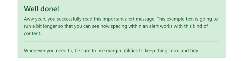
<div class="alert alert-success">
<h4 class="alert-heading">Well done!</h4>
<p>Aww yeah, you successfully read this important alert message. This example text is going to run a bit longer so that you can see how spacing within an alert works with this kind of content.</p>
<hr>
<p class="mb-0">Whenever you need to, be sure to use margin utilities to keep things nice and tidy.</p>
</div>
9.4 关闭提示框
可以通过给提示框添加.alert-dismissible类、给关闭按钮添加.close类和data-dismiss="alert"属性来实现关闭提示框操作。
1
2
3
4
<div class="alert alert-warning alert-dismissible">
<strong>Holy guacamole!</strong> You should check in on some of those fields below.
<button type="button" class="close" data-dismiss="alert">×</button>
</div>

9.5 淡入淡出
.fade和.show类设置关闭提示框时的淡入淡出效果。
1
<div class="alert alert-warning alert-dismissible fade show">
10.按钮
官方文档:https://getbootstrap.com/docs/4.1/components/buttons/
10.1 创建按钮
Bootstrap使用.btn和.btn-{color}类实现不同样式的按钮。这些类可用于<button>, <a>或<input>元素上。
1
2
3
4
5
6
7
8
9
10
<button type="button" class="btn">Default</button>
<button type="button" class="btn btn-primary">Primary</button>
<button type="button" class="btn btn-secondary">Secondary</button>
<button type="button" class="btn btn-success">Success</button>
<button type="button" class="btn btn-danger">Danger</button>
<button type="button" class="btn btn-warning">Warning</button>
<button type="button" class="btn btn-info">Info</button>
<button type="button" class="btn btn-light">Light</button>
<button type="button" class="btn btn-dark">Dark</button>
<button type="button" class="btn btn-link">Link</button>

10.2 边框按钮
使用.btn-outline-{color}类显示边框按钮。
1
2
3
4
5
6
7
8
<button type="button" class="btn btn-outline-primary">Primary</button>
<button type="button" class="btn btn-outline-secondary">Secondary</button>
<button type="button" class="btn btn-outline-success">Success</button>
<button type="button" class="btn btn-outline-danger">Danger</button>
<button type="button" class="btn btn-outline-warning">Warning</button>
<button type="button" class="btn btn-outline-info">Info</button>
<button type="button" class="btn btn-outline-light">Light</button>
<button type="button" class="btn btn-outline-dark">Dark</button>

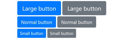
10.3 按钮大小
.btn-lg和.btn-sm类设置较大和较小的按钮。
1
2
3
4
5
6
7
8
9
10
11
12
<div class="my-1">
    <button type="button" class="btn btn-primary btn-lg">Large button</button>
    <button type="button" class="btn btn-secondary btn-lg">Large button</button>
</div>
<div class="my-1">
    <button type="button" class="btn btn-primary">Normal button</button>
    <button type="button" class="btn btn-secondary">Normal button</button>
</div>
<div class="my-1">
    <button type="button" class="btn btn-primary btn-sm">Small button</button>
    <button type="button" class="btn btn-secondary btn-sm">Small button</button>
</div>
10.4 块级按钮
.btn-block类设置块级按钮,每个按钮占一整行。
1
2
<button type="button" class="btn btn-primary btn-block">Block level button</button>
<button type="button" class="btn btn-secondary btn-block">Block level button</button>

10.5 禁用按钮
对于<button>元素添加disabled属性,对于<a>元素添加.disabled类。
1
2
<button type="button" class="btn btn-primary" disabled>Disabled button</button>
<a href="#" class="btn btn-secondary disabled">Disabled link</a>

11.按钮组
官方文档:https://getbootstrap.com/docs/4.1/components/button-group/
11.1 创建按钮组
Bootstrap按钮组可以将按钮放在同一行上。使用.btn-group类创建按钮组。
1
2
3
4
5
<div class="btn-group">
    <button type="button" class="btn btn-danger">Left</button>
    <button type="button" class="btn btn-warning">Center</button>
    <button type="button" class="btn btn-success">Right</button>
</div>

11.2 按钮组大小
.btn-group-lg和.btn-group-sm类设置较大和较小的按钮组。
1
2
3
4
5
6
7
8
9
10
11
12
13
14
15
<div class="btn-group btn-group-lg">
    <button type="button" class="btn btn-danger">Large</button>
    <button type="button" class="btn btn-warning">button</button>
    <button type="button" class="btn btn-success">group</button>
</div>
<div class="btn-group">
    <button type="button" class="btn btn-danger">Normal</button>
    <button type="button" class="btn btn-warning">button</button>
    <button type="button" class="btn btn-success">group</button>
</div>
<div class="btn-group btn-group-sm">
    <button type="button" class="btn btn-danger">Small</button>
    <button type="button" class="btn btn-warning">button</button>
    <button type="button" class="btn btn-success">group</button>
</div>

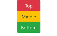
11.3 垂直按钮组
使用.btn-group-vertical类创建垂直按钮组。
1
2
3
4
5
<div class="btn-group-vertical">
    <button type="button" class="btn btn-danger">Top</button>
    <button type="button" class="btn btn-warning">Middle</button>
    <button type="button" class="btn btn-success">Bottom</button>
</div>
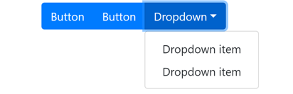
11.4 下拉菜单
可以在按钮组内嵌入另一个按钮组,实现下拉菜单。
1
2
3
4
5
6
7
8
9
10
11
<div class="btn-group mt-1">
    <button type="button" class="btn btn-primary">Button</button>
    <button type="button" class="btn btn-primary">Button</button>
    <div class="btn-group">
        <button type="button" class="btn btn-primary dropdown-toggle" data-toggle="dropdown">Dropdown</button>
        <div class="dropdown-menu">
            <a href="#" class="dropdown-item">Dropdown item</a>
            <a href="#" class="dropdown-item">Dropdown item</a>
        </div>
    </div>
</div>
12.徽章
官方文档:https://getbootstrap.com/docs/4.1/components/badge/
12.1 创建徽章
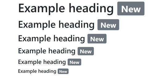
徽章(badge)主要用于突出显示新的或未读的项。Bootstrap使用.badge加上.badge-{color}类实现徽章。这些类用于<span>元素。
1
2
3
4
5
6
<h1>Example heading <span class="badge badge-secondary">New</span></h1>
<h2>Example heading <span class="badge badge-secondary">New</span></h2>
<h3>Example heading <span class="badge badge-secondary">New</span></h3>
<h4>Example heading <span class="badge badge-secondary">New</span></h4>
<h5>Example heading <span class="badge badge-secondary">New</span></h5>
<h6>Example heading <span class="badge badge-secondary">New</span></h6>
12.2 徽章颜色
1
2
3
4
5
6
7
8
<span class="badge badge-primary">Primary</span>
<span class="badge badge-secondary">Secondary</span>
<span class="badge badge-success">Success</span>
<span class="badge badge-danger">Danger</span>
<span class="badge badge-warning">Warning</span>
<span class="badge badge-info">Info</span>
<span class="badge badge-light">Light</span>
<span class="badge badge-dark">Dark</span>

12.3 胶囊形徽章
.badge-pill类设置胶囊形徽章。
1
2
3
4
5
6
7
8
<span class="badge badge-pill badge-primary">Primary</span>
<span class="badge badge-pill badge-secondary">Secondary</span>
<span class="badge badge-pill badge-success">Success</span>
<span class="badge badge-pill badge-danger">Danger</span>
<span class="badge badge-pill badge-warning">Warning</span>
<span class="badge badge-pill badge-info">Info</span>
<span class="badge badge-pill badge-light">Light</span>
<span class="badge badge-pill badge-dark">Dark</span>

12.4 徽章嵌入到按钮内
1
2
3
4
5
6
<button type="button" class="btn btn-primary">
    Messages <span class="badge badge-light">4</span>
</button>
<button type="button" class="btn btn-danger">
    Notifications <span class="badge badge-light">7</span>
</button>

13.进度条
官方文档:https://getbootstrap.com/docs/4.1/components/progress/
13.1 创建进度条
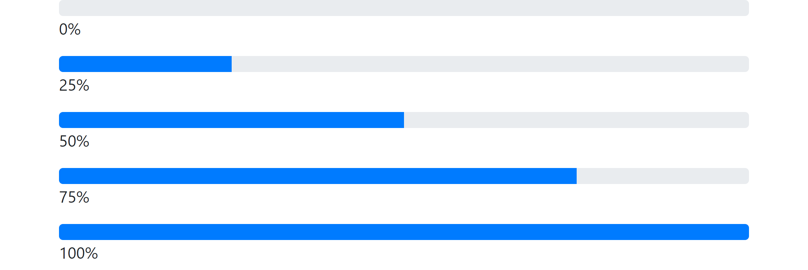
首先创建一个带有.progress类的<div>。之后在内部创建一个带有.progress-bar类的空<div>,并指定宽度style属性。
例如:
1
2
3
<div class="progress">
    <div class="progress-bar" style="width: 75%"></div>
</div>
设定宽度也可以使用Bootstrap提供的辅助类:w-25, w-50, w-75, w-100。
1
2
3
4
5
6
7
8
9
10
11
12
13
14
15
16
17
18
19
20
<div class="progress">
    <div class="progress-bar"></div>
</div>
<p>0%</p>
<div class="progress">
    <div class="progress-bar w-25"></div>
</div>
<p>25%</p>
<div class="progress">
    <div class="progress-bar w-50"></div>
</div>
<p>50%</p>
<div class="progress">
    <div class="progress-bar w-75"></div>
</div>
<p>75%</p>
<div class="progress">
    <div class="progress-bar w-100"></div>
</div>
<p>100%</p>
13.2 标签
可以在进度条内添加文本,将文本放置在内层<div>中即可。
1
2
3
<div class="progress">
    <div class="progress-bar" style="width: 20%">20%</div>
</div>

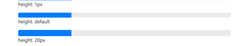
13.3 高度
设置外层<div>的高度style属性即可。
1
2
3
4
5
6
7
8
9
10
11
12
<div class="progress" style="height: 1px">
    <div class="progress-bar w-25"></div>
</div>
<p>height: 1px</p>
<div class="progress">
    <div class="progress-bar w-25"></div>
</div>
<p>height: default</p>
<div class="progress" style="height: 20px">
    <div class="progress-bar w-25"></div>
</div>
<p>height: 20px</p>
13.4 背景色
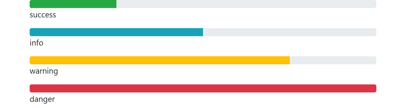
可以在内层<div>设置背景色类.bg-{color}来设置进度条的颜色。
1
2
3
4
5
6
7
8
9
10
11
12
13
14
15
16
<div class="progress">
    <div class="progress-bar bg-success" style="width: 25%"></div>
</div>
<p>success</p>
<div class="progress">
    <div class="progress-bar bg-info" style="width: 50%"></div>
</div>
<p>info</p>
<div class="progress">
    <div class="progress-bar bg-warning" style="width: 75%"></div>
</div>
<p>warning</p>
<div class="progress">
    <div class="progress-bar bg-danger" style="width: 100%"></div>
</div>
<p>danger</p>
13.5 条纹
给内层<div>添加.progress-bar-striped类来设置条纹进度条。
1
2
3
4
5
6
7
8
9
10
11
12
13
14
15
<div class="progress my-2">
    <div class="progress-bar progress-bar-striped" style="width: 10%"></div>
</div>
<div class="progress my-2">
    <div class="progress-bar progress-bar-striped bg-success" style="width: 25%"></div>
</div>
<div class="progress my-2">
    <div class="progress-bar progress-bar-striped bg-info" style="width: 50%"></div>
</div>
<div class="progress my-2">
    <div class="progress-bar progress-bar-striped bg-warning" style="width: 75%"></div>
</div>
<div class="progress my-2">
    <div class="progress-bar progress-bar-striped bg-danger" style="width: 100%"></div>
</div>

13.6 动画
给内层<div>添加.progress-bar-animated类来设置进度条动画。
1
2
3
<div class="progress">
    <div class="progress-bar progress-bar-striped progress-bar-animated w-50"></div>
</div>
13.7 多进度条
可以在一个.progress中包含多个.progress-bar。
1
2
3
4
5
<div class="progress">
    <div class="progress-bar bg-success" style="width: 40%">success</div>
    <div class="progress-bar bg-warning" style="width: 10%">warning</div>
    <div class="progress-bar bg-danger" style="width: 20%">danger</div>
</div>

14.分页
官方文档:https://getbootstrap.com/docs/4.1/components/pagination/
14.1 创建分页栏
Bootstrap使用<ul>元素实现分页栏。<ul>元素添加.pagination类,<li>元素添加.page-item类,<li>中的<a>添加.page-link类。
1
2
3
4
5
6
7
<ul class="pagination">
    <li class="page-item"><a class="page-link" href="#">Previous</a></li>
    <li class="page-item"><a class="page-link" href="#">1</a></li>
    <li class="page-item"><a class="page-link" href="#">2</a></li>
    <li class="page-item"><a class="page-link" href="#">3</a></li>
    <li class="page-item"><a class="page-link" href="#">Next</a></li>
</ul>

14.2 使用图标
将 “Previous” 和 “Next” 分别改为«和»即可。
1
2
3
4
5
6
7
<ul class="pagination">
<li class="page-item"><a class="page-link" href="#"><span>«</span></a></li>
<li class="page-item"><a class="page-link" href="#">1</a></li>
<li class="page-item"><a class="page-link" href="#">2</a></li>
<li class="page-item"><a class="page-link" href="#">3</a></li>
<li class="page-item"><a class="page-link" href="#"><span>»</span></a></li>
</ul>

14.3 激活和禁用
使用.active类高亮显示当前页,使用.disabled类设置链接不可点击。这两个类用于<li>元素。
1
2
3
4
5
6
7
<ul class="pagination">
    <li class="page-item disabled"><a class="page-link" href="#">Previous</a></li>
    <li class="page-item active"><a class="page-link" href="#">1</a></li>
    <li class="page-item"><a class="page-link" href="#">2</a></li>
    <li class="page-item"><a class="page-link" href="#">3</a></li>
    <li class="page-item"><a class="page-link" href="#">Next</a></li>
</ul>

14.4 分页栏大小
.pagination-lg和.pagination-sm类设置较大和较小的分页栏。
1
2
3
4
5
6
7
8
9
10
11
12
13
14
15
16
17
18
19
20
21
<ul class="pagination pagination-lg">
    <li class="page-item"><a class="page-link" href="#">Previous</a></li>
    <li class="page-item"><a class="page-link" href="#">1</a></li>
    <li class="page-item"><a class="page-link" href="#">2</a></li>
    <li class="page-item"><a class="page-link" href="#">3</a></li>
    <li class="page-item"><a class="page-link" href="#">Next</a></li>
</ul>
<ul class="pagination">
    <li class="page-item"><a class="page-link" href="#">Previous</a></li>
    <li class="page-item"><a class="page-link" href="#">1</a></li>
    <li class="page-item"><a class="page-link" href="#">2</a></li>
    <li class="page-item"><a class="page-link" href="#">3</a></li>
    <li class="page-item"><a class="page-link" href="#">Next</a></li>
</ul>
<ul class="pagination pagination-sm">
    <li class="page-item"><a class="page-link" href="#">Previous</a></li>
    <li class="page-item"><a class="page-link" href="#">1</a></li>
    <li class="page-item"><a class="page-link" href="#">2</a></li>
    <li class="page-item"><a class="page-link" href="#">3</a></li>
    <li class="page-item"><a class="page-link" href="#">Next</a></li>
</ul>

15.列表组
官方文档:https://getbootstrap.com/docs/4.1/components/list-group/
15.1 创建列表组
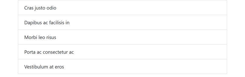
列表组用于显示一系列内容,Bootstrap使用<ul>元素实现列表组。<ul>元素添加.list-group类,<li>元素添加.list-group-item类。
1
2
3
4
5
6
7
<ul class="list-group">
    <li class="list-group-item">Cras justo odio</li>
    <li class="list-group-item">Dapibus ac facilisis in</li>
    <li class="list-group-item">Morbi leo risus</li>
    <li class="list-group-item">Porta ac consectetur ac</li>
    <li class="list-group-item">Vestibulum at eros</li>
</ul>
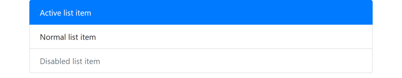
15.2 激活和禁用列表项
使用.active类设置激活的列表项,使用.disabled类设置禁用的列表项。这两个类用于<li>元素。
1
2
3
4
5
<ul class="list-group">
    <li class="list-group-item active">Active list item</li>
    <li class="list-group-item">Normal list item</li>
    <li class="list-group-item disabled">Disabled list item</li>
</ul>
15.3 链接和按钮列表项
要创建链接或按钮列表项,将<ul>替换为<div>,<li>替换为<a>或<button>并添加.list-group-item-action类。注意不要使用.btn类。
1
2
3
4
5
6
7
8
9
10
11
12
13
14
15
<div class="list-group">
    <a href="#" class="list-group-item list-group-item-action active">Cras justo odio</a>
    <a href="#" class="list-group-item list-group-item-action">Dapibus ac facilisis in</a>
    <a href="#" class="list-group-item list-group-item-action">Morbi leo risus</a>
    <a href="#" class="list-group-item list-group-item-action">Porta ac consectetur ac</a>
    <a href="#" class="list-group-item list-group-item-action disabled">Vestibulum at eros</a>
</div>

<div class="list-group">
    <button type="button" class="list-group-item list-group-item-action active">Cras justo odio</button>
    <button type="button" class="list-group-item list-group-item-action">Dapibus ac facilisis in</button>
    <button type="button" class="list-group-item list-group-item-action">Morbi leo risus</button>
    <button type="button" class="list-group-item list-group-item-action">Porta ac consectetur ac</button>
    <button type="button" class="list-group-item list-group-item-action" disabled>Vestibulum at eros</button>
</div>
外观上与普通列表项没有区别,但是可以点击。
15.4 无边框列表组
给<ul>添加.list-group-flush类设置无边框列表组。
1
2
3
4
5
6
7
<ul class="list-group list-group-flush">
    <li class="list-group-item">Cras justo odio</li>
    <li class="list-group-item">Dapibus ac facilisis in</li>
    <li class="list-group-item">Morbi leo risus</li>
    <li class="list-group-item">Porta ac consectetur ac</li>
    <li class="list-group-item">Vestibulum at eros</li>
</ul>

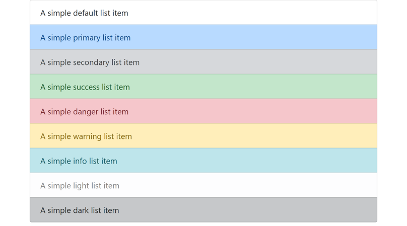
15.5 列表项颜色
使用.list-group-item-{color}类设置列表项颜色。这些类可以和.list-group-item-action类一起使用。
1
2
3
4
5
6
7
8
9
10
11
<ul class="list-group">
    <li class="list-group-item">A simple default list item</li>
    <li class="list-group-item list-group-item-primary">A simple primary list item</li>
    <li class="list-group-item list-group-item-secondary">A simple secondary list item</li>
    <li class="list-group-item list-group-item-success">A simple success list item</li>
    <li class="list-group-item list-group-item-danger">A simple danger list item</li>
    <li class="list-group-item list-group-item-warning">A simple warning list item</li>
    <li class="list-group-item list-group-item-info">A simple info list item</li>
    <li class="list-group-item list-group-item-light">A simple light list item</li>
    <li class="list-group-item list-group-item-dark">A simple dark list item</li>
</ul>
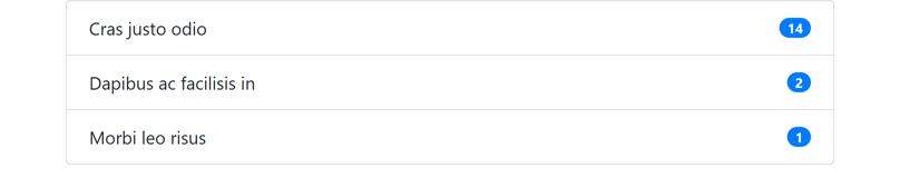
15.6 带徽章的列表项
1
2
3
4
5
6
7
8
9
10
11
12
13
14
<ul class="list-group">
    <li class="list-group-item d-flex justify-content-between align-items-center">
        Cras justo odio
        <span class="badge badge-primary badge-pill">14</span>
    </li>
    <li class="list-group-item d-flex justify-content-between align-items-center">
        Dapibus ac facilisis in
        <span class="badge badge-primary badge-pill">2</span>
    </li>
    <li class="list-group-item d-flex justify-content-between align-items-center">
        Morbi leo risus
        <span class="badge badge-primary badge-pill">1</span>
    </li>
</ul>
16.卡片
官方文档:https://getbootstrap.com/docs/4.1/components/card/
16.1 创建卡片
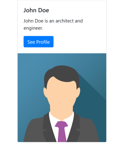
卡片是一种灵活的、可扩展的内容容器。使用.card类创建一个卡片。
示例:
1
2
3
4
5
6
7
8
<div class="card" style="width: 300px">
    <img src="https://static.runoob.com/images/mix/img_avatar.png" class="card-img-top" alt="Card image">
    <div class="card-body">
        <h5 class="card-title">John Doe</h5>
        <p class="card-text">John Doe is an architect and engineer.</p>
        <a href="#" class="btn btn-primary">See Profile</a>
    </div>
</div>

16.2 内容类型
卡片支持多种内容,包括文本、图片、链接、列表组等。
16.2.1 主体
使用.card-body类创建卡片主体。
1
2
3
<div class="card">
    <div class="card-body">This is some text within a card body.</div>
</div>

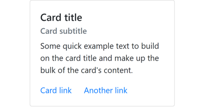
16.2.2 标题、文本和链接
- 标题:给
<h*>元素添加.card-title类 - 副标题:给
<h*>元素添加.card-subtitle类 - 文本:给
<p>元素添加.card-text类 - 链接:给
<a>元素添加.card-link类
这些元素放在.card-body中,因为.card-body设置了适当的padding。
1
2
3
4
5
6
7
8
9
<div class="card" style="width: 18rem;">
    <div class="card-body">
        <h5 class="card-title">Card title</h5>
        <h6 class="card-subtitle text-muted mb-2">Card subtitle</h6>
        <p class="card-text">Some quick example text to build on the card title and make up the bulk of the card's content.</p>
        <a href="#" class="card-link">Card link</a>
        <a href="#" class="card-link">Another link</a>
    </div>
</div>
16.2.3 图片
图片在文字上方:给<img>元素添加.card-img-top类,并放置在.card-body之前。
1
2
3
4
5
6
7
8
<div class="card" style="width: 300px">
    <img src="https://static.runoob.com/images/mix/img_avatar.png" class="card-img-top" alt="Card image">
    <div class="card-body">
        <h5 class="card-title">John Doe</h5>
        <p class="card-text">John Doe is an architect and engineer.</p>
        <a href="#" class="btn btn-primary">See Profile</a>
    </div>
</div>

图片在文字下方:给<img>元素添加.card-img-bottom类,并放置在.card-body之后。
1
2
3
4
5
6
7
8
<div class="card" style="width: 300px">
    <div class="card-body">
        <h5 class="card-title">John Doe</h5>
        <p class="card-text">John Doe is an architect and engineer.</p>
        <a href="#" class="btn btn-primary">See Profile</a>
    </div>
    <img src="https://static.runoob.com/images/mix/img_avatar.png" class="card-img-bottom" alt="Card image">
</div>
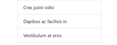
16.2.4 列表组
在卡片中使用.list-group-flush创建无边框的列表组。
1
2
3
4
5
6
7
<div class="card" style="width: 18rem;">
    <ul class="list-group list-group-flush">
        <li class="list-group-item">Cras justo odio</li>
        <li class="list-group-item">Dapibus ac facilisis in</li>
        <li class="list-group-item">Vestibulum at eros</li>
    </ul>
</div>
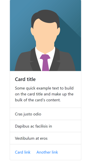
16.2.5 组合内容
将图片、文字、列表组和链接组合在一起。
注意图片和列表组在.card-body外部,一个卡片可以包含多个.card-body。
1
2
3
4
5
6
7
8
9
10
11
12
13
14
15
16
<div class="card" style="width: 18rem;">
    <img src="https://static.runoob.com/images/mix/img_avatar.png" class="card-img-top" alt="Card image cap">
    <div class="card-body">
        <h5 class="card-title">Card title</h5>
        <p class="card-text">Some quick example text to build on the card title and make up the bulk of the card's content.</p>
    </div>
    <ul class="list-group list-group-flush">
        <li class="list-group-item">Cras justo odio</li>
        <li class="list-group-item">Dapibus ac facilisis in</li>
        <li class="list-group-item">Vestibulum at eros</li>
    </ul>
    <div class="card-body">
        <a href="#" class="card-link">Card link</a>
        <a href="#" class="card-link">Another link</a>
    </div>
</div>
16.2.6 header和footer
使用.card-header和.card-footer类设置header和footer。
1
2
3
4
5
6
7
8
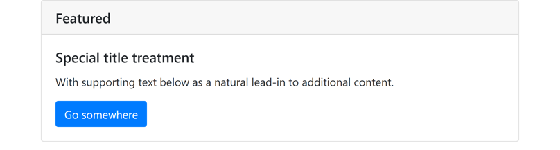
<div class="card">
<h5 class="card-header">Featured</h5>
<div class="card-body">
<h5 class="card-title">Special title treatment</h5>
<p class="card-text">With supporting text below as a natural lead-in to additional content.</p>
<a href="#" class="btn btn-primary">Go somewhere</a>
</div>
</div>
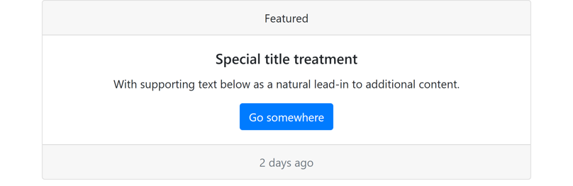
1
2
3
4
5
6
7
8
9
<div class="card text-center">
    <div class="card-header">Featured</div>
    <div class="card-body">
        <h5 class="card-title">Special title treatment</h5>
        <p class="card-text">With supporting text below as a natural lead-in to additional content.</p>
        <a href="#" class="btn btn-primary">Go somewhere</a>
    </div>
    <div class="card-footer text-muted">2 days ago</div>
</div>
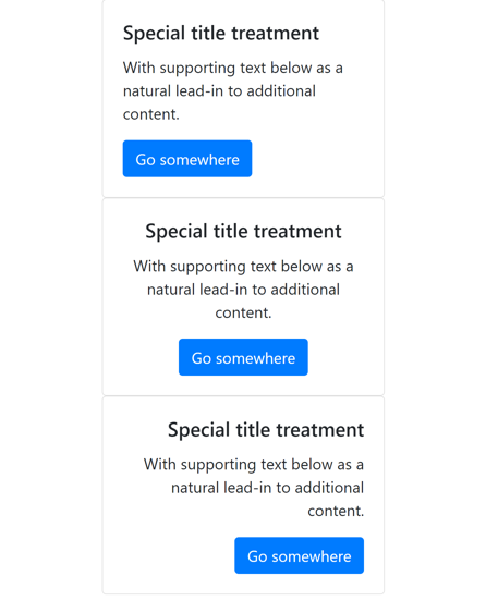
16.3 卡片大小
卡片默认为100%宽度,也可以通过网格类、宽度辅助类或style属性的方式自定义。
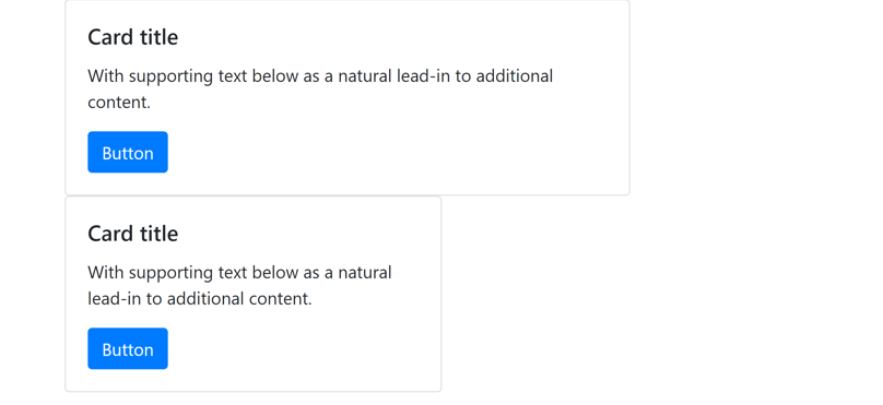
16.3.1 网格类
1
2
3
4
5
6
7
8
9
10
11
12
13
14
15
16
17
18
19
20
<div class="row">
    <div class="col">
        <div class="card">
            <div class="card-body">
                <h5 class="card-title">Special title treatment</h5>
                <p class="card-text">With supporting text below as a natural lead-in to additional content.</p>
                <a href="#" class="btn btn-primary">Go somewhere</a>
            </div>
        </div>
    </div>
</div>

16.3.2 宽度辅助类
宽度辅助类w-25, w-50, w-75, w-100分别设置宽度为25%, 50%, 75%, 100%。
1
2
3
4
5
6
7
8
9
10
11
12
13
14
<div class="card w-75">
    <div class="card-body">
        <h5 class="card-title">Card title</h5>
        <p class="card-text">With supporting text below as a natural lead-in to additional content.</p>
        <a href="#" class="btn btn-primary">Button</a>
    </div>
</div>
<div class="card w-50">
    <div class="card-body">
        <h5 class="card-title">Card title</h5>
        <p class="card-text">With supporting text below as a natural lead-in to additional content.</p>
        <a href="#" class="btn btn-primary">Button</a>
    </div>
</div>
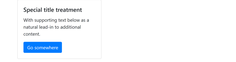
16.3.3 自定义样式
直接指定宽度style属性。
1
2
3
4
5
6
7
<div class="card" style="width: 18rem;">
    <div class="card-body">
        <h5 class="card-title">Special title treatment</h5>
        <p class="card-text">With supporting text below as a natural lead-in to additional content.</p>
        <a href="#" class="btn btn-primary">Go somewhere</a>
    </div>
</div>
16.4 文本对齐
使用文本对齐辅助类.text-{left|center|right}设置文本对齐方式。
1
2
3
4
5
6
7
8
9
10
11
12
13
14
15
16
17
18
19
20
21
<div class="card text-left" style="width: 18rem;">
    <div class="card-body">
        <h5 class="card-title">Special title treatment</h5>
        <p class="card-text">With supporting text below as a natural lead-in to additional content.</p>
        <a href="#" class="btn btn-primary">Go somewhere</a>
    </div>
</div>
<div class="card text-center" style="width: 18rem;">
    <div class="card-body">
        <h5 class="card-title">Special title treatment</h5>
        <p class="card-text">With supporting text below as a natural lead-in to additional content.</p>
        <a href="#" class="btn btn-primary">Go somewhere</a>
    </div>
</div>
<div class="card text-right" style="width: 18rem;">
    <div class="card-body">
        <h5 class="card-title">Special title treatment</h5>
        <p class="card-text">With supporting text below as a natural lead-in to additional content.</p>
        <a href="#" class="btn btn-primary">Go somewhere</a>
    </div>
</div>
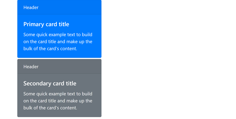
16.5 卡片样式
16.5.1 背景和文字颜色
使用辅助类.bg-{color}和.text-{color}设置卡片的背景和文字颜色。
1
2
3
4
5
6
7
8
9
10
11
12
13
14
<div class="card text-white bg-primary mb-1" style="width: 18rem;">
    <div class="card-header">Header</div>
    <div class="card-body">
        <h5 class="card-title">Primary card title</h5>
        <p class="card-text">Some quick example text to build on the card title and make up the bulk of the card's content.</p>
    </div>
</div>
<div class="card text-white bg-secondary mb-1" style="width: 18rem;">
    <div class="card-header">Header</div>
    <div class="card-body">
        <h5 class="card-title">Secondary card title</h5>
        <p class="card-text">Some quick example text to build on the card title and make up the bulk of the card's content.</p>
    </div>
</div>
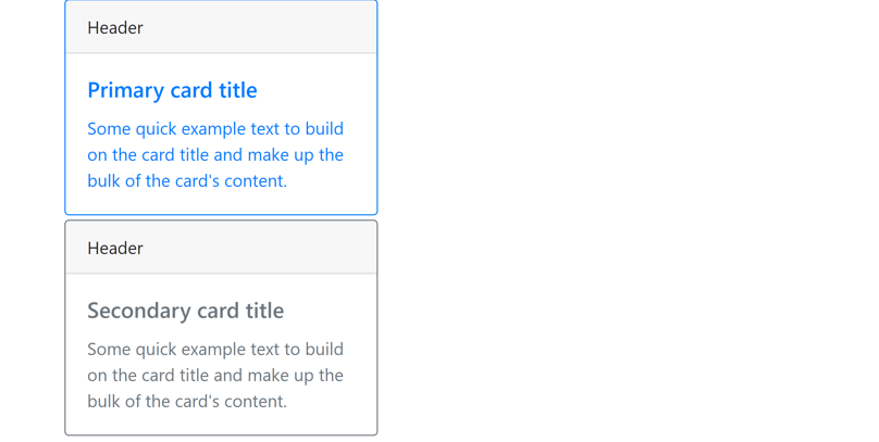
16.5.2 边框
使用辅助类.border-{color}设置卡片的边框颜色。注意.border-{color}和.text-{color}类可用于外层的.card,可也用于卡片内容。
1
2
3
4
5
6
7
8
9
10
11
12
13
14
<div class="card border-primary mb-1" style="width: 18rem;">
    <div class="card-header">Header</div>
    <div class="card-body text-primary">
        <h5 class="card-title">Primary card title</h5>
        <p class="card-text">Some quick example text to build on the card title and make up the bulk of the card's content.</p>
    </div>
</div>
<div class="card border-secondary mb-1" style="width: 18rem;">
    <div class="card-header">Header</div>
    <div class="card-body text-secondary">
        <h5 class="card-title">Secondary card title</h5>
        <p class="card-text">Some quick example text to build on the card title and make up the bulk of the card's content.</p>
    </div>
</div>
16.6 卡片布局
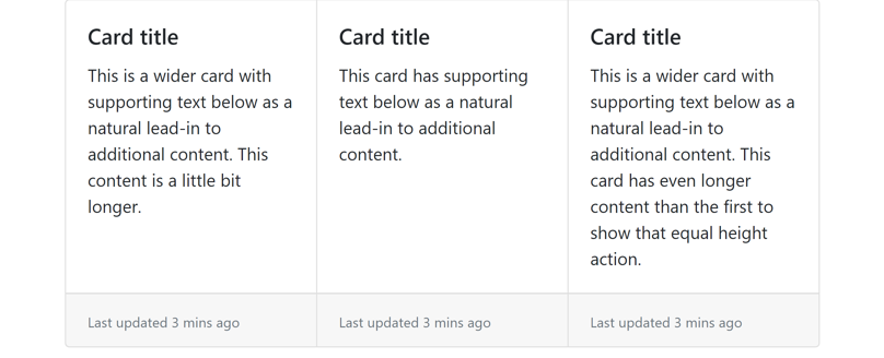
16.6.1 卡片组
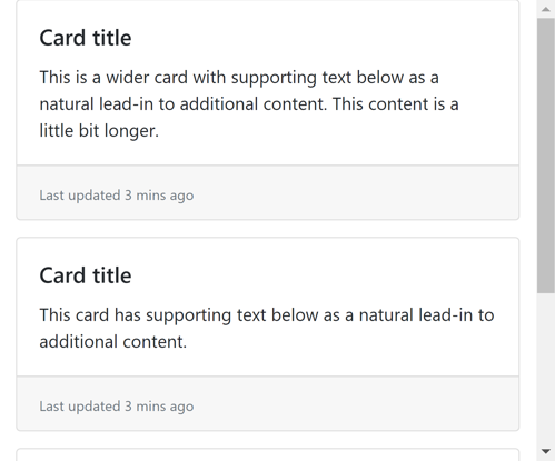
卡片组用于渲染等宽、等高、紧靠在一起的卡片(类似于按钮组)。使用.card-group类创建卡片组。
1
2
3
4
5
6
7
8
9
10
11
12
13
14
15
16
17
18
19
20
21
22
23
24
25
26
27
28
29
<div class="card-group">
    <div class="card">
        <div class="card-body">
            <h5 class="card-title">Card title</h5>
            <p class="card-text">This is a wider card with supporting text below as a natural lead-in to additional content. This content is a little bit longer.</p>
        </div>
        <div class="card-footer">
            <small class="text-muted">Last updated 3 mins ago</small>
        </div>
    </div>
    <div class="card">
        <div class="card-body">
            <h5 class="card-title">Card title</h5>
            <p class="card-text">This card has supporting text below as a natural lead-in to additional content.</p>
        </div>
        <div class="card-footer">
            <small class="text-muted">Last updated 3 mins ago</small>
        </div>
    </div>
    <div class="card">
        <div class="card-body">
            <h5 class="card-title">Card title</h5>
            <p class="card-text">This is a wider card with supporting text below as a natural lead-in to additional content. This card has even longer content than the first to show that equal height action.</p>
        </div>
        <div class="card-footer">
            <small class="text-muted">Last updated 3 mins ago</small>
        </div>
    </div>
</div>
在小屏幕上会显示为上下排列:
16.6.2 卡片deck
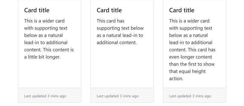
卡片deck用于渲染等宽、等高、不靠在一起的卡片。使用.card-deck类创建卡片deck。
1
2
3
4
5
6
7
8
9
10
11
12
13
14
15
16
17
18
19
20
21
22
23
24
25
26
27
28
29
<div class="card-deck">
    <div class="card">
        <div class="card-body">
            <h5 class="card-title">Card title</h5>
            <p class="card-text">This is a wider card with supporting text below as a natural lead-in to additional content. This content is a little bit longer.</p>
        </div>
        <div class="card-footer">
            <small class="text-muted">Last updated 3 mins ago</small>
        </div>
    </div>
    <div class="card">
        <div class="card-body">
            <h5 class="card-title">Card title</h5>
            <p class="card-text">This card has supporting text below as a natural lead-in to additional content.</p>
        </div>
        <div class="card-footer">
            <small class="text-muted">Last updated 3 mins ago</small>
        </div>
    </div>
    <div class="card">
        <div class="card-body">
            <h5 class="card-title">Card title</h5>
            <p class="card-text">This is a wider card with supporting text below as a natural lead-in to additional content. This card has even longer content than the first to show that equal height action.</p>
        </div>
        <div class="card-footer">
            <small class="text-muted">Last updated 3 mins ago</small>
        </div>
    </div>
</div>
16.6.3 卡片列
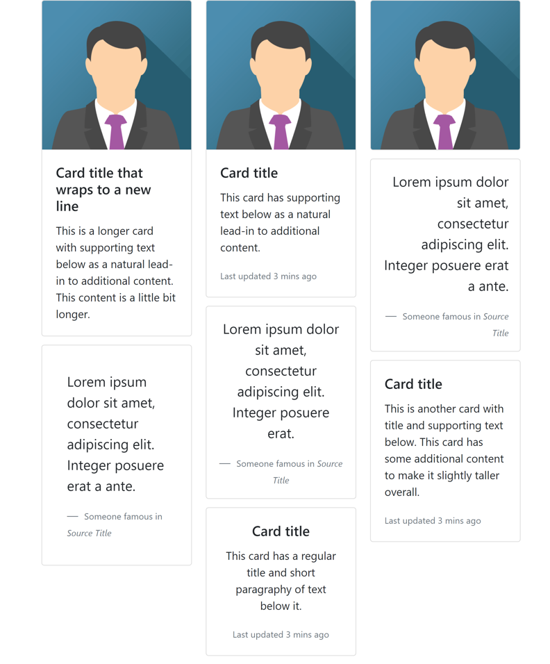
在卡片列中卡片按从上到下、从左到右的顺序排列。使用.card-column类创建卡片列。
1
2
3
4
5
6
7
8
9
10
11
12
13
14
15
16
17
18
19
20
21
22
23
24
25
26
27
28
29
30
31
32
33
34
35
36
37
38
39
40
41
42
43
44
45
46
47
48
49
50
51
52
53
54
55
56
57
58
59
60
61
62
<div class="card-columns">
    <div class="card">
        <img class="card-img-top" src="https://static.runoob.com/images/mix/img_avatar.png">
        <div class="card-body">
            <h5 class="card-title">Card title that wraps to a new line</h5>
            <p class="card-text">This is a longer card with supporting text below as a natural lead-in to additional content. This content is a little bit longer.</p>
        </div>
    </div>
    <div class="card p-3">
        <blockquote class="blockquote mb-0 card-body">
            <p>Lorem ipsum dolor sit amet, consectetur adipiscing elit. Integer posuere erat a ante.</p>
            <footer class="blockquote-footer">
                <small class="text-muted">
                    Someone famous in <cite title="Source Title">Source Title</cite>
                </small>
            </footer>
        </blockquote>
    </div>
    <div class="card">
        <img class="card-img-top" src="https://static.runoob.com/images/mix/img_avatar.png">
        <div class="card-body">
            <h5 class="card-title">Card title</h5>
            <p class="card-text">This card has supporting text below as a natural lead-in to additional content.</p>
            <p class="card-text"><small class="text-muted">Last updated 3 mins ago</small></p>
        </div>
    </div>
    <div class="card text-center p-3">
        <blockquote class="blockquote mb-0">
            <p>Lorem ipsum dolor sit amet, consectetur adipiscing elit. Integer posuere erat.</p>
            <footer class="blockquote-footer">
                <small>Someone famous in <cite title="Source Title">Source Title</cite></small>
            </footer>
        </blockquote>
    </div>
    <div class="card text-center">
        <div class="card-body">
            <h5 class="card-title">Card title</h5>
            <p class="card-text">This card has a regular title and short paragraphy of text below it.</p>
            <p class="card-text"><small class="text-muted">Last updated 3 mins ago</small></p>
        </div>
    </div>
    <div class="card">
        <img class="card-img" src="https://static.runoob.com/images/mix/img_avatar.png">
    </div>
    <div class="card p-3 text-right">
        <blockquote class="blockquote mb-0">
            <p>Lorem ipsum dolor sit amet, consectetur adipiscing elit. Integer posuere erat a ante.</p>
            <footer class="blockquote-footer">
                <small class="text-muted">
                    Someone famous in <cite title="Source Title">Source Title</cite>
                </small>
            </footer>
        </blockquote>
    </div>
    <div class="card">
        <div class="card-body">
            <h5 class="card-title">Card title</h5>
            <p class="card-text">This is another card with title and supporting text below. This card has some additional content to make it slightly taller overall.</p>
            <p class="card-text"><small class="text-muted">Last updated 3 mins ago</small></p>
        </div>
    </div>
</div>
17.下拉菜单
官方文档:https://getbootstrap.com/docs/4.1/components/dropdowns/
实现下拉菜单依赖于popper.min.js。
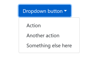
17.1 创建下拉菜单
- 创建一个
<div>并添加.dropdown或.btn-group类 - 切换按钮:在
<div>内部创建一个<button>并添加.dropdown-toggle类,或者创建一个<a>并添加data-toggle="dropdown"属性 - 菜单:与切换按钮并列创建一个
<div>并添加.dropdown-menu类 - 菜单项:在
.dropdown-menu内部创建<a>元素并添加.dropdown-item类
使用<button>:
1
2
3
4
5
6
7
8
<div class="dropdown">
    <button type="button" class="btn btn-primary dropdown-toggle" data-toggle="dropdown">Dropdown button</button>
    <div class="dropdown-menu">
        <a class="dropdown-item" href="#">Action</a>
        <a class="dropdown-item" href="#">Another action</a>
        <a class="dropdown-item" href="#">Something else here</a>
    </div>
</div>
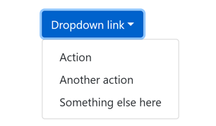
使用<a>:
1
2
3
4
5
6
7
8
<div class="dropdown">
    <a href="#" class="btn btn-primary dropdown-toggle" data-toggle="dropdown">Dropdown link</a>
    <div class="dropdown-menu">
        <a class="dropdown-item" href="#">Action</a>
        <a class="dropdown-item" href="#">Another action</a>
        <a class="dropdown-item" href="#">Something else here</a>
    </div>
</div>
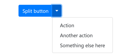
17.2 分割按钮
使用按钮组和.dropdown-toggle-split类将下箭头设置为单独的按钮。
1
2
3
4
5
6
7
8
9
<div class="btn-group">
    <button type="button" class="btn btn-primary">Split button</button>
    <button type="button" class="btn btn-primary dropdown-toggle dropdown-toggle-split" data-toggle="dropdown"></button>
    <div class="dropdown-menu">
        <a class="dropdown-item" href="#">Action</a>
        <a class="dropdown-item" href="#">Another action</a>
        <a class="dropdown-item" href="#">Something else here</a>
    </div>
</div>
17.3 大小
和按钮一样,使用.btn-lg和.btn-sm类设置大小。
1
2
3
4
5
6
7
8
9
10
11
12
13
14
15
16
17
18
19
20
21
22
23
24
25
26
27
28
29
30
31
32
33
34
35
<div class="btn-group">
    <button type="button" class="btn btn-secondary btn-lg dropdown-toggle" data-toggle="dropdown">Large button</button>
    <div class="dropdown-menu">
        <a class="dropdown-item" href="#">Action</a>
        <a class="dropdown-item" href="#">Another action</a>
        <a class="dropdown-item" href="#">Something else here</a>
    </div>
</div>
<div class="btn-group">
    <button type="button" class="btn btn-secondary btn-lg">Large split button</button>
    <button type="button" class="btn btn-secondary btn-lg dropdown-toggle dropdown-toggle-split" data-toggle="dropdown"></button>
    <div class="dropdown-menu">
        <a class="dropdown-item" href="#">Action</a>
        <a class="dropdown-item" href="#">Another action</a>
        <a class="dropdown-item" href="#">Something else here</a>
    </div>
</div>

<div class="btn-group">
    <button type="button" class="btn btn-secondary btn-sm dropdown-toggle" data-toggle="dropdown">Small button</button>
    <div class="dropdown-menu">
        <a class="dropdown-item" href="#">Action</a>
        <a class="dropdown-item" href="#">Another action</a>
        <a class="dropdown-item" href="#">Something else here</a>
    </div>
</div>
<div class="btn-group">
    <button type="button" class="btn btn-secondary btn-sm">Small split button</button>
    <button type="button" class="btn btn-secondary btn-sm dropdown-toggle dropdown-toggle-split" data-toggle="dropdown"></button>
    <div class="dropdown-menu">
        <a class="dropdown-item" href="#">Action</a>
        <a class="dropdown-item" href="#">Another action</a>
        <a class="dropdown-item" href="#">Something else here</a>
    </div>
</div>

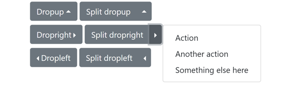
17.4 方向
使用.dropup, .dropright和.dropleft类设置菜单从上方、右侧和左侧弹出。这些类用于最外层<div>。
1
2
3
4
5
6
7
8
9
10
11
12
13
14
15
16
17
18
19
20
21
22
23
24
25
26
27
28
29
30
31
32
33
34
35
36
37
38
39
40
41
42
43
44
45
46
47
48
49
50
51
52
53
<div class="btn-group dropup my-1">
    <button type="button" class="btn btn-secondary dropdown-toggle" data-toggle="dropdown">Dropup</button>
    <div class="dropdown-menu">
        <a class="dropdown-item" href="#">Action</a>
        <a class="dropdown-item" href="#">Another action</a>
        <a class="dropdown-item" href="#">Something else here</a>
    </div>
</div>
<div class="btn-group dropup my-1">
    <button type="button" class="btn btn-secondary">Split dropup</button>
    <button type="button" class="btn btn-secondary dropdown-toggle dropdown-toggle-split" data-toggle="dropdown"></button>
    <div class="dropdown-menu">
        <a class="dropdown-item" href="#">Action</a>
        <a class="dropdown-item" href="#">Another action</a>
        <a class="dropdown-item" href="#">Something else here</a>
    </div>
</div>
<br>
<div class="btn-group dropright my-1">
    <button type="button" class="btn btn-secondary dropdown-toggle" data-toggle="dropdown">Dropright</button>
    <div class="dropdown-menu">
        <a class="dropdown-item" href="#">Action</a>
        <a class="dropdown-item" href="#">Another action</a>
        <a class="dropdown-item" href="#">Something else here</a>
    </div>
</div>
<div class="btn-group dropright my-1">
    <button type="button" class="btn btn-secondary">Split dropright</button>
    <button type="button" class="btn btn-secondary dropdown-toggle dropdown-toggle-split" data-toggle="dropdown"></button>
    <div class="dropdown-menu">
        <a class="dropdown-item" href="#">Action</a>
        <a class="dropdown-item" href="#">Another action</a>
        <a class="dropdown-item" href="#">Something else here</a>
    </div>
</div>
<br>
<div class="btn-group dropleft my-1">
    <button type="button" class="btn btn-secondary dropdown-toggle" data-toggle="dropdown">Dropleft</button>
    <div class="dropdown-menu">
        <a class="dropdown-item" href="#">Action</a>
        <a class="dropdown-item" href="#">Another action</a>
        <a class="dropdown-item" href="#">Something else here</a>
    </div>
</div>
<div class="btn-group dropleft my-1">
    <button type="button" class="btn btn-secondary">Split dropleft</button>
    <button type="button" class="btn btn-secondary dropdown-toggle dropdown-toggle-split" data-toggle="dropdown"></button>
    <div class="dropdown-menu">
        <a class="dropdown-item" href="#">Action</a>
        <a class="dropdown-item" href="#">Another action</a>
        <a class="dropdown-item" href="#">Something else here</a>
    </div>
</div>
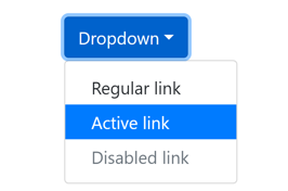
17.5 激活和禁用菜单项
使用.active类设置激活的菜单项,使用.disabled类设置禁用的菜单项。
1
2
3
4
5
6
7
8
<div class="dropdown">
    <button type="button" class="btn btn-primary dropdown-toggle" data-toggle="dropdown">Dropdown</button>
    <div class="dropdown-menu">
        <a class="dropdown-item" href="#">Regular link</a>
        <a class="dropdown-item active" href="#">Active link</a>
        <a class="dropdown-item disabled" href="#">Disabled link</a>
    </div>
</div>
17.6 菜单内容
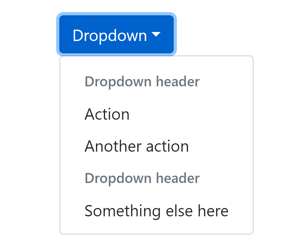
17.6.1 标题
使用带有.dropdown-header类的<h*>元素添加菜单标题。
1
2
3
4
5
6
7
8
9
10
<div class="dropdown">
    <button type="button" class="btn btn-primary dropdown-toggle" data-toggle="dropdown">Dropdown</button>
    <div class="dropdown-menu">
        <h6 class="dropdown-header">Dropdown header</h6>
        <a class="dropdown-item" href="#">Action</a>
        <a class="dropdown-item" href="#">Another action</a>
        <h6 class="dropdown-header">Dropdown header</h6>
        <a class="dropdown-item" href="#">Something else here</a>
    </div>
</div>
17.6.2 分割线
使用带有.dropdown-divider类的<div>元素添加分割线。
1
2
3
4
5
6
7
8
9
10
<div class="dropdown">
    <button type="button" class="btn btn-primary dropdown-toggle" data-toggle="dropdown">Dropdown</button>
    <div class="dropdown-menu">
        <a class="dropdown-item" href="#">Action</a>
        <a class="dropdown-item" href="#">Another action</a>
        <a class="dropdown-item" href="#">Something else here</a>
        <div class="dropdown-divider"></div>
        <a class="dropdown-item" href="#">Separated link</a>
    </div>
</div>

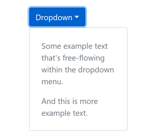
17.6.3 文本
下拉菜单中可以放置任意文本,使用间距辅助类调整间距。
1
2
3
4
5
6
7
<div class="dropdown">
    <button type="button" class="btn btn-primary dropdown-toggle" data-toggle="dropdown">Dropdown</button>
    <div class="dropdown-menu p-4 text-muted" style="max-width: 200px;">
        <p>Some example text that's free-flowing within the dropdown menu.</p>
        <p class="mb-0">And this is more example text.</p>
    </div>
</div>
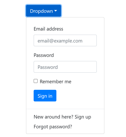
17.6.4 表单
1
2
3
4
5
6
7
8
9
10
11
12
13
14
15
16
17
18
19
20
21
22
23
<div class="dropdown">
    <button type="button" class="btn btn-primary dropdown-toggle" data-toggle="dropdown">Dropdown</button>
    <div class="dropdown-menu">
        <form class="px-4 py-3">
            <div class="form-group">
                <label for="email">Email address</label>
                <input id="email" type="email" class="form-control" placeholder="email@example.com">
            </div>
            <div class="form-group">
                <label for="password">Password</label>
                <input id="password" type="password" class="form-control" placeholder="Password">
            </div>
            <div class="form-check">
                <input id="check" type="checkbox" class="form-check-input">
                <label class="form-check-label" for="check">Remember me</label>
            </div>
            <button type="submit" class="btn btn-primary mt-3">Sign in</button>
        </form>
        <div class="dropdown-divider"></div>
        <a href="#" class="dropdown-item">New around here? Sign up</a>
        <a href="#" class="dropdown-item">Forgot password?</a>
    </div>
</div>
18.折叠
官方文档:https://getbootstrap.com/docs/4.1/components/collapse/
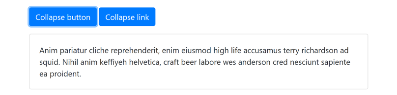
18.1 创建折叠
Bootstrap折叠可以实现内容的显示与隐藏。
- 给目标元素添加
.collapse类(默认隐藏)或.collapse和.show类(默认显示),并指定id属性。 - 使用
<button>或<a>元素作为控制按钮,目标元素的id属性作为<button>的data-target属性或<a>的href属性,并添加data-toggle="collapse"属性。
示例:
1
2
3
4
5
6
7
8
9
<p>
    <button type="button" class="btn btn-primary" data-target="#collapse-example" data-toggle="collapse">Collapse button</button>
    <a href="#collapse-example" class="btn btn-primary" data-toggle="collapse">Collapse link</a>
</p>
<div id="collapse-example" class="collapse">
    <div class="card card-body">
        Anim pariatur cliche reprehenderit, enim eiusmod high life accusamus terry richardson ad squid. Nihil anim keffiyeh helvetica, craft beer labore wes anderson cred nesciunt sapiente ea proident.
    </div>
</div>
18.2 多个目标
<button>和<a>的data-target属性实际上是jQuery选择器,因此可以使用类选择器控制多个目标元素。
(下面的.multi-collapse类是自定义的,不是Bootstrap提供的类)
1
2
3
4
5
6
7
8
9
10
11
12
13
14
15
16
17
18
19
20
21
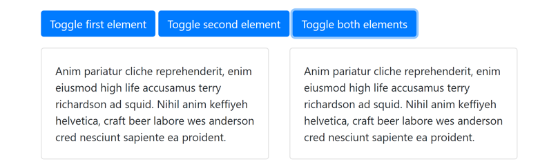
<p>
<button type="button" class="btn btn-primary" data-target="#collapse-target1" data-toggle="collapse">Toggle first element</button>
<a href="#collapse-target2" class="btn btn-primary" data-toggle="collapse">Toggle second element</a>
<button type="button" class="btn btn-primary" data-target=".multi-collapse" data-toggle="collapse">Toggle both elements</button>
</p>
<div class="row">
<div class="col">
<div id="collapse-target1" class="collapse multi-collapse">
<div class="card card-body">
Anim pariatur cliche reprehenderit, enim eiusmod high life accusamus terry richardson ad squid. Nihil anim keffiyeh helvetica, craft beer labore wes anderson cred nesciunt sapiente ea proident.
</div>
</div>
</div>
<div class="col">
<div id="collapse-target2" class="collapse multi-collapse">
<div class="card card-body">
Anim pariatur cliche reprehenderit, enim eiusmod high life accusamus terry richardson ad squid. Nihil anim keffiyeh helvetica, craft beer labore wes anderson cred nesciunt sapiente ea proident.
</div>
</div>
</div>
</div>
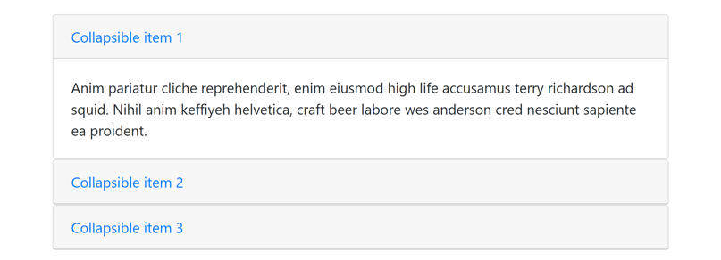
18.3 手风琴示例
1
2
3
4
5
6
7
8
9
10
11
12
13
14
15
16
17
18
19
20
21
22
23
24
25
26
27
28
29
30
31
32
33
34
<div id="accordion">
    <div class="card">
        <div class="card-header">
            <a href="#collapse1" class="card-link" data-toggle="collapse">Collapsible item 1</a>
        </div>
        <div id="collapse1" class="collapse show" data-parent="#accordion">
            <div class="card-body">
                Anim pariatur cliche reprehenderit, enim eiusmod high life accusamus terry richardson ad squid. Nihil anim keffiyeh helvetica, craft beer labore wes anderson cred nesciunt sapiente ea proident.
            </div>
        </div>
    </div>

    <div class="card">
        <div class="card-header">
            <a href="#collapse2" class="card-link" data-toggle="collapse">Collapsible item 2</a>
        </div>
        <div id="collapse2" class="collapse" data-parent="#accordion">
            <div class="card-body">
                Anim pariatur cliche reprehenderit, enim eiusmod high life accusamus terry richardson ad squid. Nihil anim keffiyeh helvetica, craft beer labore wes anderson cred nesciunt sapiente ea proident.
            </div>
        </div>
    </div>

    <div class="card">
        <div class="card-header">
            <a href="#collapse3" class="card-link" data-toggle="collapse">Collapsible item 3</a>
        </div>
        <div id="collapse3" class="collapse" data-parent="#accordion">
            <div class="card-body">
                Anim pariatur cliche reprehenderit, enim eiusmod high life accusamus terry richardson ad squid. Nihil anim keffiyeh helvetica, craft beer labore wes anderson cred nesciunt sapiente ea proident.
            </div>
        </div>
    </div>
</div>
19.导航
官方文档:https://getbootstrap.com/docs/4.1/components/navs/
19.1 基础导航
导航(nav)由一系列链接组成。Bootstrap使用<ul>或<nav>元素加.nav类实现导航。
1
2
3
4
5
6
7
8
9
10
11
<ul class="nav bg-light">
    <li class="nav-item">
        <a href="#" class="nav-link active">Active</a>
    </li>
    <li class="nav-item">
        <a href="#" class="nav-link">Link</a>
    </li>
    <li class="nav-item">
        <a href="#" class="nav-link disabled">Disabled</a>
    </li>
</ul>

1
2
3
4
5
<nav class="nav bg-light">
    <a href="#" class="nav-link active">Active</a>
    <a href="#" class="nav-link">Link</a>
    <a href="#" class="nav-link disabled">Disabled</a>
</nav>

19.2 导航样式
19.2.1 对齐方式
使用.justify-content-center和.justify-content-end类设置导航栏水平居中和右对齐。
1
2
3
4
5
6
7
8
9
10
11
12
13
14
15
16
17
<ul class="nav bg-light my-1">
    <li class="nav-item"><a href="#" class="nav-link active">Active</a></li>
    <li class="nav-item"><a href="#" class="nav-link">Link</a></li>
    <li class="nav-item"><a href="#" class="nav-link disabled">Disabled</a></li>
</ul>

<ul class="nav bg-light justify-content-center my-1">
    <li class="nav-item"><a href="#" class="nav-link active">Active</a></li>
    <li class="nav-item"><a href="#" class="nav-link">Link</a></li>
    <li class="nav-item"><a href="#" class="nav-link disabled">Disabled</a></li>
</ul>

<ul class="nav bg-light justify-content-end my-1">
    <li class="nav-item"><a href="#" class="nav-link active">Active</a></li>
    <li class="nav-item"><a href="#" class="nav-link">Link</a></li>
    <li class="nav-item"><a href="#" class="nav-link disabled">Disabled</a></li>
</ul>

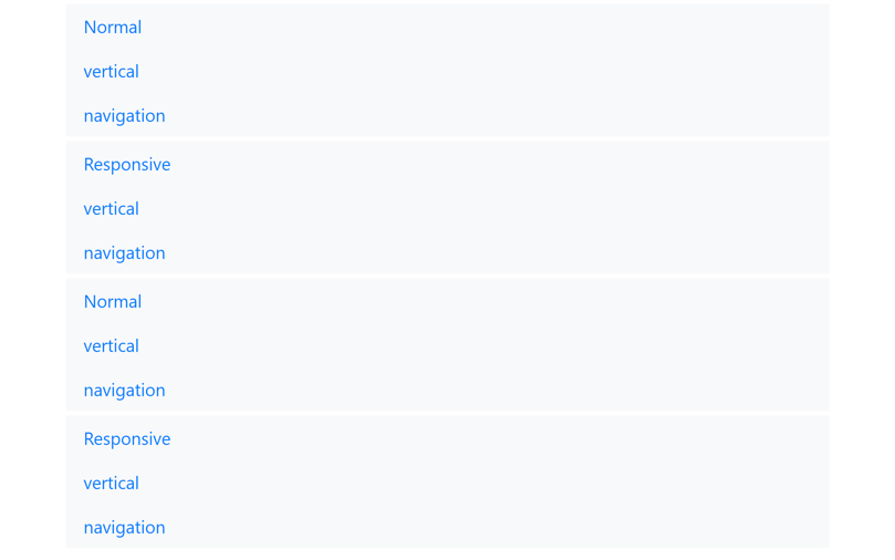
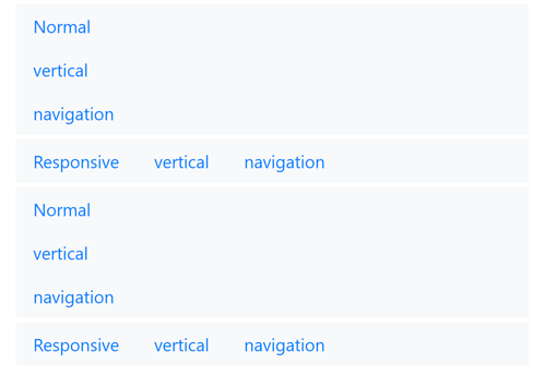
19.2.2 垂直导航
使用.flex-column类设置垂直导航,使用.flex-{sm|md|lg|xl}-column设置只有当屏幕宽度大于等于指定的类型时垂直排列。
1
2
3
4
5
6
7
8
9
10
11
12
13
14
15
16
17
18
19
20
21
22
23
<ul class="nav flex-column bg-light my-1">
    <li class="nav-item"><a href="#" class="nav-link">Normal</a></li>
    <li class="nav-item"><a href="#" class="nav-link">vertical</a></li>
    <li class="nav-item"><a href="#" class="nav-link">navigation</a></li>
</ul>

<ul class="nav flex-sm-column bg-light my-1">
    <li class="nav-item"><a href="#" class="nav-link">Responsive</a></li>
    <li class="nav-item"><a href="#" class="nav-link">vertical</a></li>
    <li class="nav-item"><a href="#" class="nav-link">navigation</a></li>
</ul>

<nav class="nav flex-column bg-light my-1">
    <a href="#" class="nav-link">Normal</a>
    <a href="#" class="nav-link">vertical</a>
    <a href="#" class="nav-link">navigation</a>
</nav>

<nav class="nav flex-sm-column bg-light my-1">
    <a href="#" class="nav-link">Responsive</a>
    <a href="#" class="nav-link">vertical</a>
    <a href="#" class="nav-link">navigation</a>
</nav>
电脑端:
手机端:
19.2.3 选项卡
使用.nav-tabs类创建选项卡样式的导航。
1
2
3
4
5
<ul class="nav nav-tabs bg-light">
    <li class="nav-item"><a href="#" class="nav-link active">Active</a></li>
    <li class="nav-item"><a href="#" class="nav-link">Link</a></li>
    <li class="nav-item"><a href="#" class="nav-link disabled">Disabled</a></li>
</ul>

19.2.4 胶囊形导航
使用.nav-pills类创建胶囊形导航。
1
2
3
4
5
<ul class="nav nav-pills">
    <li class="nav-item"><a href="#" class="nav-link active">Active</a></li>
    <li class="nav-item"><a href="#" class="nav-link">Link</a></li>
    <li class="nav-item"><a href="#" class="nav-link disabled">Disabled</a></li>
</ul>

19.2.5 整行导航
.nav-fill类设置导航占一整行,导航中的每一项不一定等宽。
1
2
3
4
5
6
<ul class="nav nav-tabs nav-fill bg-light">
    <li class="nav-item"><a href="#" class="nav-link active">Active nav link</a></li>
    <li class="nav-item"><a href="#" class="nav-link">Link</a></li>
    <li class="nav-item"><a href="#" class="nav-link">Link</a></li>
    <li class="nav-item"><a href="#" class="nav-link">Link</a></li>
</ul>

如果使用<nav>则每个<a>元素要添加.nav-item类。
1
2
3
4
5
6
<nav class="nav nav-tabs nav-fill bg-light">
    <a href="#" class="nav-item nav-link active">Active nav link</a>
    <a href="#" class="nav-item nav-link">Link</a>
    <a href="#" class="nav-item nav-link">Link</a>
    <a href="#" class="nav-item nav-link">Link</a>
</nav>

19.2.6 等宽导航
.nav-justified类设置导航占一整行,且导航中的每一项等宽显示。
1
2
3
4
5
6
<ul class="nav nav-tabs nav-justified bg-light">
    <li class="nav-item"><a href="#" class="nav-link active">Active nav link</a></li>
    <li class="nav-item"><a href="#" class="nav-link">Link</a></li>
    <li class="nav-item"><a href="#" class="nav-link">Link</a></li>
    <li class="nav-item"><a href="#" class="nav-link">Link</a></li>
</ul>

1
2
3
4
5
6
<nav class="nav nav-tabs nav-justified bg-light">
    <a href="#" class="nav-item nav-link active">Active nav link</a>
    <a href="#" class="nav-item nav-link">Link</a>
    <a href="#" class="nav-item nav-link">Link</a>
    <a href="#" class="nav-item nav-link">Link</a>
</nav>

19.3 下拉菜单
19.3.1 带下拉菜单的选项卡导航
1
2
3
4
5
6
7
8
9
10
11
12
13
14
15
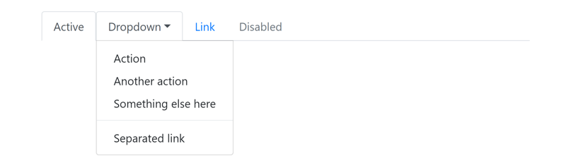
<ul class="nav nav-tabs">
<li class="nav-item"><a class="nav-link active" href="#">Active</a></li>
<li class="nav-item dropdown">
<a href="#" class="nav-link dropdown-toggle" data-toggle="dropdown">Dropdown</a>
<div class="dropdown-menu">
<a class="dropdown-item" href="#">Action</a>
<a class="dropdown-item" href="#">Another action</a>
<a class="dropdown-item" href="#">Something else here</a>
<div class="dropdown-divider"></div>
<a class="dropdown-item" href="#">Separated link</a>
</div>
</li>
<li class="nav-item"><a class="nav-link" href="#">Link</a></li>
<li class="nav-item"><a class="nav-link disabled" href="#">Disabled</a></li>
</ul>
19.3.2 带下拉菜单的胶囊形导航
1
2
3
4
5
6
7
8
9
10
11
12
13
14
15
<ul class="nav nav-pills">
    <li class="nav-item"><a class="nav-link active" href="#">Active</a></li>
    <li class="nav-item dropdown">
        <a href="#" class="nav-link dropdown-toggle" data-toggle="dropdown">Dropdown</a>
        <div class="dropdown-menu">
            <a class="dropdown-item" href="#">Action</a>
            <a class="dropdown-item" href="#">Another action</a>
            <a class="dropdown-item" href="#">Something else here</a>
            <div class="dropdown-divider"></div>
            <a class="dropdown-item" href="#">Separated link</a>
        </div>
    </li>
    <li class="nav-item"><a class="nav-link" href="#">Link</a></li>
    <li class="nav-item"><a class="nav-link disabled" href="#">Disabled</a></li>
</ul>
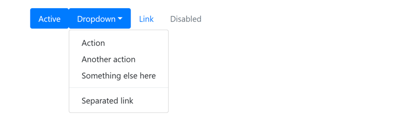
19.4 可切换选项卡
实现可切换选项卡依赖于bootstrap.min.js
- 选项卡内容统一放在一个设置了
.tab-content的<div>元素中。 - 该
<div>中每个设置了.tab-pane的<div>对应一个选项卡要展示的内容,并设置id属性。 - 每个选项卡链接添加
data-toggle="tab"属性,href属性设置为对应内容<div>的id。
1
2
3
4
5
6
7
8
9
10
11
12
13
14
15
16
17
18
19
20
21
22
23
24
25
<ul class="nav nav-tabs">
    <li class="nav-item">
        <a href="#home" class="nav-link active" data-toggle="tab">Home</a>
    </li>
    <li class="nav-item">
        <a href="#profile" class="nav-link" data-toggle="tab">Profile</a>
    </li>
    <li class="nav-item">
        <a href="#contact" class="nav-link" data-toggle="tab">Contact</a>
    </li>
</ul>
<div class="tab-content">
    <div id="home" class="tab-pane fade show active">
        <h3>Home</h3>
        <p>Lorem ipsum dolor sit amet, consectetur adipisicing elit, sed do eiusmod tempor incididunt ut labore et dolore magna aliqua.</p>
    </div>
    <div id="profile" class="tab-pane fade">
        <h3>Profile</h3>
        <p>Ut enim ad minim veniam, quis nostrud exercitation ullamco laboris nisi ut aliquip ex ea commodo consequat.</p>
    </div>
    <div id="contact" class="tab-pane fade">
        <h3>Contact</h3>
        <p>Sed ut perspiciatis unde omnis iste natus error sit voluptatem accusantium doloremque laudantium, totam rem aperiam.</p>
    </div>
</div>
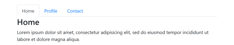
1
2
3
4
5
6
7
8
<nav class="nav nav-tabs">
    <a href="#home" class="nav-item nav-link active" data-toggle="tab">Home</a>
    <a href="#profile" class="nav-item nav-link" data-toggle="tab">Profile</a>
    <a href="#contact" class="nav-item nav-link" data-toggle="tab">Contact</a>
</nav>
<div class="tab-content">
    ...
</div>

19.4.1 胶囊形可切换选项卡
1
2
3
4
5
6
7
8
9
10
11
12
13
14
<ul class="nav nav-pills mb-3">
    <li class="nav-item">
        <a href="#home" class="nav-link active" data-toggle="pill">Home</a>
    </li>
    <li class="nav-item">
        <a href="#profile" class="nav-link" data-toggle="pill">Profile</a>
    </li>
    <li class="nav-item">
        <a href="#contact" class="nav-link" data-toggle="pill">Contact</a>
    </li>
</ul>
<div class="tab-content">
    ...
</div>
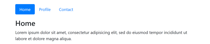
19.4.2 可切换垂直选项卡
1
2
3
4
5
6
7
8
9
10
11
12
13
14
<div class="row">
    <div class="col-3">
        <nav class="nav nav-pills flex-column">
            <a href="#home" class="nav-link active" data-toggle="pill">Home</a>
            <a href="#profile" class="nav-link" data-toggle="pill">Profile</a>
            <a href="#contact" class="nav-link" data-toggle="pill">Contact</a>
        </nav>
    </div>
    <div class="col-9">
        <div class="tab-content">
            ...
        </div>
    </div>
</div>
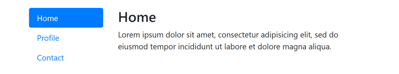
20.导航栏
官方文档:https://getbootstrap.com/docs/4.1/components/navbar/
20.1 创建导航栏
导航栏(navbar)与导航类似,但一般放在页面顶部(<header>元素内)。
Bootstrap使用带有.navbar类的<nav>元素,并在内部创建一个带有.navbar-nav类的<ul>元素实现导航栏。
使用.navbar-expand-{sm|md|lg|xl}类实现响应式导航栏,即到屏幕宽度大于等于指定的类型时水平显示,否则垂直显示。
1
2
3
4
5
6
7
8
9
10
11
12
13
<nav class="navbar navbar-expand-sm bg-light">
    <ul class="navbar-nav">
        <li class="nav-item">
            <a href="#" class="nav-link active">Active</a>
        </li>
        <li class="nav-item">
            <a href="#" class="nav-link">Link</a>
        </li>
        <li class="nav-item">
            <a href="#" class="nav-link disabled">Disabled</a>
        </li>
    </ul>
</nav>
电脑端:
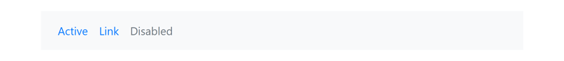
手机端:

20.2 垂直导航栏
通过删除.navbar-expand-{screen}类来创建垂直导航栏。
电脑端:

手机端:
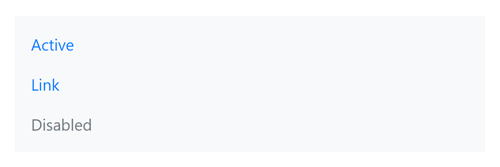
20.3 导航栏内容
导航栏可显示的内容包括品牌/logo、导航、表单、文本。
20.3.1 品牌
使用<a>元素加.navbar-brand类显示品牌(brand)(公司名称、网站名称、logo等) 形式可以是文字、图片或图片加文字。
1
2
3
4
5
6
7
8
9
10
11
12
13
14
15
16
17
18
19
20
<nav class="navbar navbar-light bg-light my-1">
    <a href="#" class="navbar-brand">Brand</a>
</nav>

<nav class="navbar navbar-light bg-light my-1">
    <h1 class="navbar-brand">Brand</h1>
</nav>

<nav class="navbar navbar-light bg-light my-1">
    <a href="#" class="navbar-brand">
        <img src="https://getbootstrap.com/docs/4.1/assets/brand/bootstrap-solid.svg" width="30" height="30" alt="brand">
    </a>
</nav>

<nav class="navbar navbar-light bg-light my-1">
    <a href="#" class="navbar-brand">
        <img src="https://getbootstrap.com/docs/4.1/assets/brand/bootstrap-solid.svg" width="30" height="30" alt="brand">
        Bootstrap
    </a>
</nav>
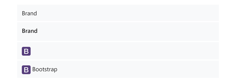
20.3.2 导航
在导航栏中创建导航的方式与普通导航类似,只是<ul>元素使用.navbar-nav类。
要创建响应式折叠导航栏:
- 将导航内容放在一个带有
.collapse和.navbar-collapse类的<div>中并设置id。 - 使用带有
.navbar-toggler类的<button>并设置data-toggle="collapse"和data-target="#xxx"(外层<div>元素的id)属性来创建折叠按钮。 - 最外层
<nav>添加.navbar-expand-{screen}类,当屏幕宽度小于指定的类型时折叠导航栏,否则正常显示;如果不添加则始终折叠。
1
2
3
4
5
6
7
8
9
10
11
12
13
14
15
16
17
18
19
20
21
22
23
<nav class="navbar navbar-expand-sm navbar-light bg-light">
    <a href="#" class="navbar-brand">Brand</a>
    <button type="button" class="navbar-toggler" data-toggle="collapse" data-target="#nav">
        <span class="navbar-toggler-icon"></span>
    </button>
    <div id="nav" class="collapse navbar-collapse">
        <ul class="navbar-nav">
            <li class="nav-item"><a class="nav-link active" href="#">Active</a></li>
            <li class="nav-item dropdown">
                <a href="#" class="nav-link dropdown-toggle" data-toggle="dropdown">Dropdown</a>
                <div class="dropdown-menu">
                    <a class="dropdown-item" href="#">Action</a>
                    <a class="dropdown-item" href="#">Another action</a>
                    <a class="dropdown-item" href="#">Something else here</a>
                    <div class="dropdown-divider"></div>
                    <a class="dropdown-item" href="#">Separated link</a>
                </div>
            </li>
            <li class="nav-item"><a class="nav-link" href="#">Link</a></li>
            <li class="nav-item"><a class="nav-link disabled" href="#">Disabled</a></li>
        </ul>
    </div>
</nav>
电脑端:
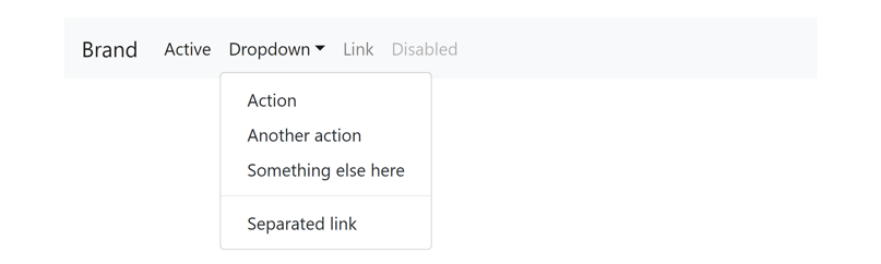
手机端:
(折叠状态)
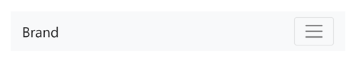
(展开状态)
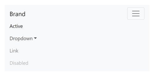
20.3.3 表单
使用<form>元素加.form-inline类创建导航栏表单(例如搜索框)。
导航栏中的内容默认分散排列,如果只有一个搜索框则左对齐,如果有一个brand和一个搜索框则分别左对齐和右对齐。
1
2
3
4
5
6
7
8
9
10
11
12
13
14
<nav class="navbar navbar-light bg-light my-1">
    <form class="form-inline">
        <input type="search" class="form-control mr-sm-2" placeholder="Search">
        <button type="submit" class="btn btn-outline-success my-2 my-sm-0">Search</button>
    </form>
</nav>

<nav class="navbar navbar-light bg-light my-1">
    <a href="#" class="navbar-brand">Brand</a>
    <form class="form-inline">
        <input type="search" class="form-control mr-sm-2" placeholder="Search">
        <button type="submit" class="btn btn-outline-success my-2 my-sm-0">Search</button>
    </form>
</nav>
电脑端:
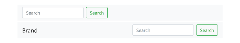
手机端:
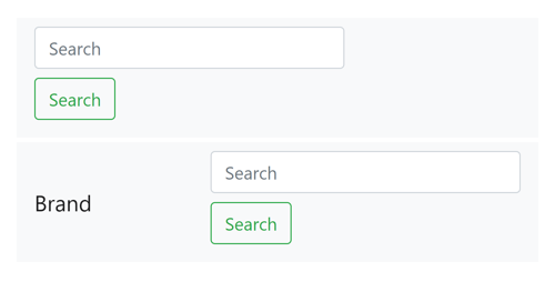
20.3.4 文本
使用<span>元素加.navbar-text类在导航栏显示普通文本。
1
2
3
4
5
6
7
8
9
10
11
12
13
14
15
16
17
18
19
<nav class="navbar navbar-light bg-light my-1">
    <span class="navbar-text">Navbar text with an inline element</span>
</nav>

<nav class="navbar navbar-expand-sm navbar-light bg-light my-1">
    <a href="#" class="navbar-brand">Brand</a>
    <ul class="navbar-nav mr-auto">
        <li class="nav-item">
            <a href="#" class="nav-link active">Active</a>
        </li>
        <li class="nav-item">
            <a href="#" class="nav-link">Link</a>
        </li>
        <li class="nav-item">
            <a href="#" class="nav-link disabled">Disabled</a>
        </li>
    </ul>
    <span class="navbar-text">Navbar text with an inline element</span>
</nav>
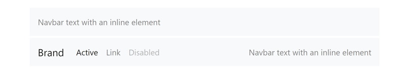
20.4 导航栏颜色
使用.navbar-light和.navbar-dark类配合背景颜色类.bg-{color}设置导航栏颜色。
.navbar-light类设置黑色文字(配合浅色背景),.navbar-dark类设置白色文字(配合深色背景)。
1
2
3
4
5
6
7
8
9
10
11
12
13
14
15
16
17
18
19
20
21
22
23
24
25
26
27
28
29
30
31
32
33
34
35
36
37
38
39
40
41
42
43
44
45
46
47
48
49
50
51
52
53
54
55
56
<nav class="navbar navbar-expand-sm navbar-light bg-light my-1">
    <a href="#" class="navbar-brand">Brand</a>
    <ul class="navbar-nav mr-auto">
        <li class="nav-item">
            <a href="#" class="nav-link active">Active</a>
        </li>
        <li class="nav-item">
            <a href="#" class="nav-link">Link</a>
        </li>
        <li class="nav-item">
            <a href="#" class="nav-link disabled">Disabled</a>
        </li>
    </ul>
    <form class="form-inline">
        <input type="search" class="form-control mr-sm-2" placeholder="Search">
        <button type="submit" class="btn btn-outline-success my-2 my-sm-0">Search</button>
    </form>
</nav>

<nav class="navbar navbar-expand-sm navbar-dark bg-dark my-1">
    <a href="#" class="navbar-brand">Brand</a>
    <ul class="navbar-nav mr-auto">
        <li class="nav-item">
            <a href="#" class="nav-link active">Active</a>
        </li>
        <li class="nav-item">
            <a href="#" class="nav-link">Link</a>
        </li>
        <li class="nav-item">
            <a href="#" class="nav-link disabled">Disabled</a>
        </li>
    </ul>
    <form class="form-inline">
        <input type="search" class="form-control mr-sm-2" placeholder="Search">
        <button type="submit" class="btn btn-outline-light my-2 my-sm-0">Search</button>
    </form>
</nav>

<nav class="navbar navbar-expand-sm navbar-dark bg-primary my-1">
    <a href="#" class="navbar-brand">Brand</a>
    <ul class="navbar-nav mr-auto">
        <li class="nav-item">
            <a href="#" class="nav-link active">Active</a>
        </li>
        <li class="nav-item">
            <a href="#" class="nav-link">Link</a>
        </li>
        <li class="nav-item">
            <a href="#" class="nav-link disabled">Disabled</a>
        </li>
    </ul>
    <form class="form-inline">
        <input type="search" class="form-control mr-sm-2" placeholder="Search">
        <button type="submit" class="btn btn-outline-light my-2 my-sm-0">Search</button>
    </form>
</nav>
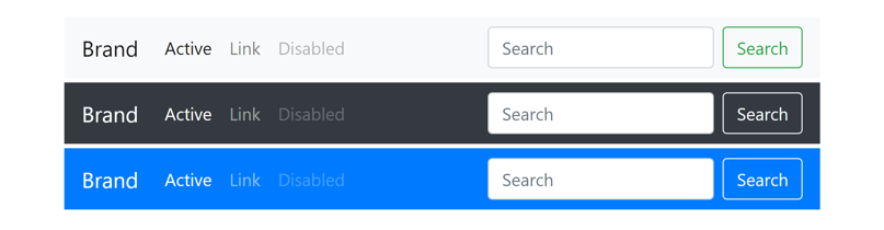
20.5 导航栏位置
.fixed-top和.fixed-bottom类设置导航栏固定在页面顶端/底端。
21.面包屑导航
官方文档:https://getbootstrap.com/docs/4.1/components/breadcrumb/
Bootstrap使用<ol>元素实现面包屑导航。<ol>元素添加.breadcrumb类,<li>元素添加.breadcrumb-item类。
1
2
3
4
5
6
7
8
9
10
11
12
13
14
<ol class="breadcrumb">
    <li class="breadcrumb-item active">Home</li>
</ol>

<ol class="breadcrumb">
    <li class="breadcrumb-item"><a href="#">Home</a></li>
    <li class="breadcrumb-item active">Library</li>
</ol>

<ol class="breadcrumb">
    <li class="breadcrumb-item"><a href="#">Home</a></li>
    <li class="breadcrumb-item"><a href="#">Library</a></li>
    <li class="breadcrumb-item active">Data</li>
</ol>
22.表单
官方文档:https://getbootstrap.com/docs/4.1/components/forms/
22.1 HTML表单输入元素总结
| 输入内容 | 元素 |
|---|---|
| 普通文本 | <input type="text"> |
| 数字 | <input type="number"> |
| 邮箱 | <input type="email"> |
| 密码 | <input type="password"> |
| 单选按钮 | <input type="radio"> |
| 复选框 | <input type="checkbox"> |
| 下拉列表 | <select><option> |
| 文本域 | <textarea> |
| 文件 | <input type="file"> |
| 颜色 | <input type="color"> |
| 日期 | <input type="date"> |
| 时间 | <input type="time"> |
| 日期时间 | <input type="datetime-local"> |
| 范围 | <input type="range"> |
| 搜索框 | <input type="search"> |
| 提交按钮 | <input type="submit"> |
| 重置按钮 | <input type="reset"> |
(自定义)<input>元素属性排序:
- 基本属性:
id,type,name,class - 限制:
max,min,maxlength,minlength,pattern等 - 内容:
placeholder,value - 布尔属性:
checked,disabled,readonly,required
22.2 创建表单
Bootstrap使用<input>等输入元素的类来控制表单样式。一定要为<input>元素选择正确的type属性。
1
2
3
4
5
6
7
8
9
10
11
12
13
14
15
16
<form>
    <div class="form-group">
        <label for="email1">Email address</label>
        <input id="email1" type="email" class="form-control" placeholder="Enter email">
        <small class="form-text text-muted">We'll never share your email with anyone else.</small>
    </div>
    <div class="form-group">
        <label for="password1">Password</label>
        <input id="password1" type="password" class="form-control" placeholder="Password">
    </div>
    <div class="form-group form-check">
        <input id="check1" type="checkbox" class="form-check-input">
        <label for="check1">Check me out</label>
    </div>
    <button type="submit" class="btn btn-primary">Submit</button>
</form>
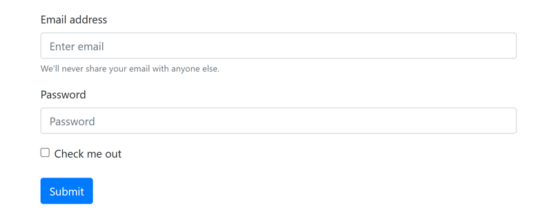
22.3 文本输入
<input>, <select>, <textarea>等文本控件使用.form-control类设置样式。文件上传框使用.form-control-file类。
1
2
3
4
5
6
7
8
9
10
11
12
13
14
15
16
17
18
19
20
21
22
23
24
25
26
27
28
29
30
31
32
33
34
<form>
    <div class="form-group">
        <label for="email1">Email address</label>
        <input id="email1" type="email" class="form-control" placeholder="name@example.com">
    </div>
    <div class="form-group">
        <label for="select1">Example select</label>
        <select id="select1" class="form-control">
            <option>1</option>
            <option>2</option>
            <option>3</option>
            <option>4</option>
            <option>5</option>
        </select>
    </div>
    <div class="form-group">
        <label for="select2">Example multiple select</label>
        <select multiple id="select2" class="form-control">
            <option>1</option>
            <option>2</option>
            <option>3</option>
            <option>4</option>
            <option>5</option>
        </select>
    </div>
    <div class="form-group">
        <label for="textarea1">Example textarea</label>
        <textarea id="textarea1" class="form-control" rows="3"></textarea>
    </div>
    <div class="form-group">
        <label for="file1">Example file input</label>
        <input id="file1" type="file" class="form-control-file">
    </div>
</form>
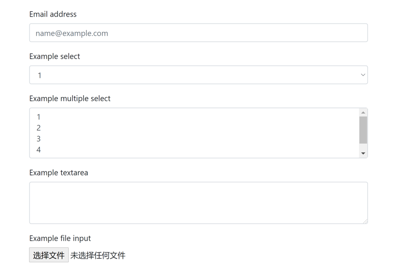
22.3.1 大小
.form-control-lg和.form-control-sm类设置较大的/较小的输入框。
1
2
3
4
5
6
7
8
9
10
11
12
13
14
<form>
    <input type="text" class="form-control form-control-lg my-1" placeholder="Large input">
    <input type="text" class="form-control my-1" placeholder="Normal input">
    <input type="text" class="form-control form-control-sm my-1" placeholder="Small input">
    <select class="form-control form-control-lg my-1">
        <option>Large select</option>
    </select>
    <select class="form-control my-1">
        <option>Normal select</option>
    </select>
    <select class="form-control form-control-sm my-1">
        <option>Small select</option>
    </select>
</form>
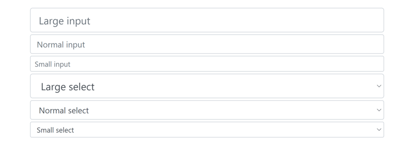
22.3.2 只读
<input>元素添加readonly属性(不是类)设置为只读,但仍然显示为输入框的样式。
1
<input type="text" class="form-control" placeholder="Readonly input" readonly>

22.3.3 只读纯文本
<input>元素添加readonly属性和.form-control-plaintext类设置为只读,且样式为纯文本。
1
2
3
4
5
6
7
8
9
10
11
12
13
14
<form>
    <div class="form-group row">
        <label for="email1" class="col-sm-2 col-form-label">Email</label>
        <div class="col-sm-10">
            <input id="email1" type="email" class="form-control-plaintext" value="email@example.com">
        </div>
    </div>
    <div class="form-group row">
        <label for="password1" class="col-sm-2 col-form-label">Password</label>
        <div class="col-sm-10">
            <input id="password1" type="password" class="form-control" placeholder="Password">
        </div>
    </div>
</form>
电脑端:
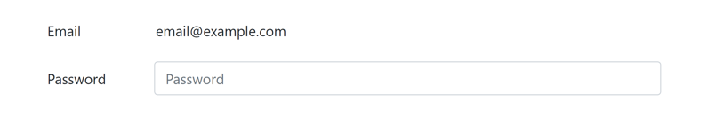
手机端:
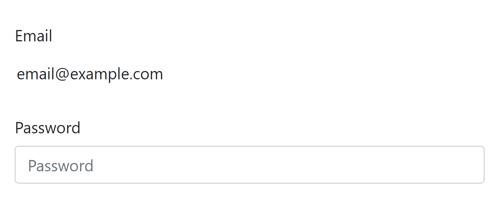
22.4 范围输入
范围输入使用.form-control-range类,样式显示为滑块(可拖动的进度条)。
1
2
3
4
5
6
<form>
    <div class="form-group">
        <label for="range1">Example Range input</label>
        <input id="range1" type="range" class="form-control-range">
    </div>
</form>
22.5 单选按钮和复选框
单选按钮和复选框使用.form-check-input类,标签使用.form-check-label类,外层包围的<div>使用.form-check类。
22.5.1 垂直排列
单选按钮和复选框默认垂直(堆叠)排列。
1
2
3
4
5
6
7
8
9
10
11
12
13
14
15
16
17
18
19
20
21
22
23
24
25
26
27
<form>
    <div class="form-check">
        <input id="check1" type="checkbox" name="check1" class="form-check-input" value="1">
        <label for="check1" class="form-check-label">Default checkbox</label>
    </div>
    <div class="form-check">
        <input id="check2" type="checkbox" name="check1" class="form-check-input" value="2" checked>
        <label for="check2" class="form-check-label">Checked checkbox</label>
    </div>
    <div class="form-check">
        <input id="check3" type="checkbox" name="check1" class="form-check-input" value="3" disabled>
        <label for="check3" class="form-check-label">Disabled checkbox</label>
    </div>

    <div class="form-check">
        <input id="radio1" type="radio" name="radio1" class="form-check-input" value="1">
        <label for="radio1" class="form-check-label">Default radio</label>
    </div>
    <div class="form-check">
        <input id="radio2" type="radio" name="radio1" class="form-check-input" value="2" checked>
        <label for="radio2" class="form-check-label">Checked radio</label>
    </div>
    <div class="form-check">
        <input id="radio3" type="radio" name="radio1" class="form-check-input" value="3" disabled>
        <label for="radio3" class="form-check-label">Disabled radio</label>
    </div>
</form>
22.5.2 水平排列
给每个单选按钮或复选框外层包围的<div>元素添加.form-check-inline类将一组单选按钮或复选框显示在同一行。
1
2
3
4
5
6
7
8
9
10
11
12
13
14
15
16
17
18
19
20
21
22
23
24
25
26
27
28
29
30
31
<form>
    <div class="form-group">
        <div class="form-check form-check-inline">
            <input id="check1" type="checkbox" name="check1" class="form-check-input" value="1">
            <label for="check1" class="form-check-label">Default checkbox</label>
        </div>
        <div class="form-check form-check-inline">
            <input id="check2" type="checkbox" name="check1" class="form-check-input" value="2" checked>
            <label for="check2" class="form-check-label">Checked checkbox</label>
        </div>
        <div class="form-check form-check-inline">
            <input id="check3" type="checkbox" name="check1" class="form-check-input" value="3" disabled>
            <label for="check3" class="form-check-label">Disabled checkbox</label>
        </div>
    </div>

    <div class="form-group">
        <div class="form-check form-check-inline">
            <input id="radio1" type="radio" name="radio1" class="form-check-input" value="1">
            <label for="radio1" class="form-check-label">Default radio</label>
        </div>
        <div class="form-check form-check-inline">
            <input id="radio2" type="radio" name="radio1" class="form-check-input" value="2" checked>
            <label for="radio2" class="form-check-label">Checked radio</label>
        </div>
        <div class="form-check form-check-inline">
            <input id="radio3" type="radio" name="radio1" class="form-check-input" value="3" disabled>
            <label for="radio3" class="form-check-label">Disabled radio</label>
        </div>
    </div>
</form>

22.6 表单布局
22.6.1 表单组
使用<div>元素加.form-group类将输入和标签分组,从而添加适当的垂直间距。
1
2
3
4
5
6
7
8
9
10
<form>
    <div class="form-group">
        <label for="input1">Example label</label>
        <input id="input1" type="text" class="form-control" placeholder="Example input">
    </div>
    <div class="form-group">
        <label for="input2">Another label</label>
        <input id="input2" type="text" class="form-control" placeholder="Another input">
    </div>
</form>
22.6.2 表单网格
使用网格类可以构造更复杂的表单。行类可以使用.row或.form-row。
1
2
3
4
5
6
7
8
9
10
11
12
13
14
15
16
17
18
19
20
21
22
23
24
25
26
27
28
29
30
31
32
33
34
35
36
37
38
39
40
41
42
43
44
<form>
    <div class="form-row">
        <div class="form-group col-sm-6">
            <label for="email1">Email</label>
            <input id="email1" type="email" class="form-control" placeholder="Email">
        </div>
        <div class="form-group col-sm-6">
            <label for="password1">Password</label>
            <input id="password1" type="password" class="form-control" placeholder="Password">
        </div>
    </div>
    <div class="form-group">
        <label for="address1">Address</label>
        <input id="address1" type="text" class="form-control" placeholder="1234 Main St">
    </div>
    <div class="form-group">
        <label for="address2">Address 2</label>
        <input id="address2" type="text" class="form-control" placeholder="Apartment, studio, or floor">
    </div>
    <div class="form-row">
        <div class="form-group col-sm-6">
            <label for="city1">City</label>
            <input id="city1" type="text" class="form-control">
        </div>
        <div class="form-group col-sm-4">
            <label for="state1">State</label>
            <select id="state1" class="form-control">
                <option selected>Choose...</option>
                <option>...</option>
            </select>
        </div>
        <div class="form-group col-sm-2">
            <label for="zip1">Zip</label>
            <input id="zip1" type="text" class="form-control">
        </div>
    </div>
    <div class="form-group">
        <div class="form-check">
            <input id="chick1" type="checkbox" class="form-check-input">
            <label for="chick1" class="form-check-label">Check me out</label>
        </div>
    </div>
    <button type="submit" class="btn btn-primary">Sign in</button>
</form>
电脑端:
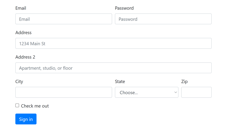
手机端:
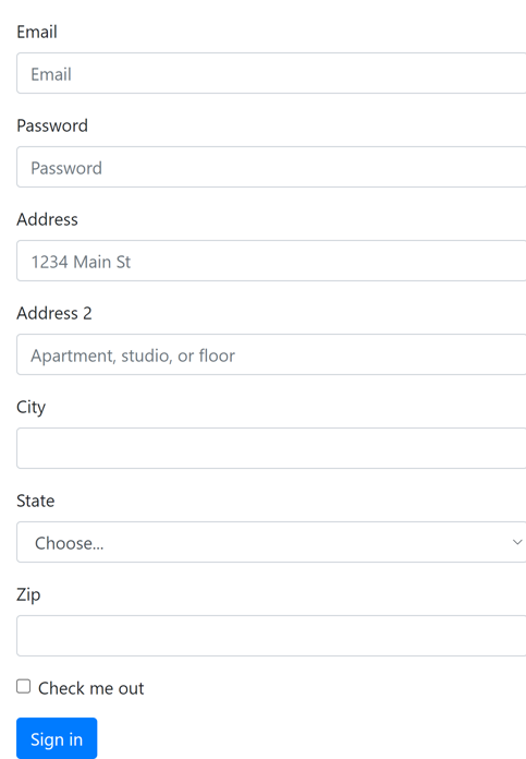
22.6.3 水平表单
给表单组<div>添加.row类,<label>元素添加.col-form-label和.col-{screen}-{n}类,将标签和输入元素显示在同一行。
1
2
3
4
5
6
7
8
9
10
11
12
13
14
15
16
17
18
19
20
21
22
23
24
25
26
27
28
29
30
31
32
33
34
35
36
37
38
39
40
41
42
43
<form>
    <div class="form-group row">
        <label for="email1" class="col-form-label col-sm-2">Email</label>
        <div class="col-sm-10">
            <input id="email1" type="email" class="form-control" placeholder="Email">
        </div>
    </div>
    <div class="form-group row">
        <label for="password1" class="col-form-label col-sm-2">Password</label>
        <div class="col-sm-10">
            <input id="password1" type="password" class="form-control" placeholder="Password">
        </div>
    </div>
    <fieldset class="form-group">
        <div class="row">
            <legend class="col-form-label col-sm-2 pt-0">Radios</legend>
            <div class="col-sm-10">
                <div class="form-check">
                    <input id="radio1" type="radio" name="radio1" class="form-check-input" value="1" checked>
                    <label for="radio1" class="form-check-label">Example radio 1</label>
                </div>
                <div class="form-check">
                    <input id="radio2" type="radio" name="radio1" class="form-check-input" value="2">
                    <label for="radio2" class="form-check-label">Example radio 2</label>
                </div>
                <div class="form-check">
                    <input id="radio3" type="radio" name="radio1" class="form-check-input" value="3" disabled>
                    <label for="radio3" class="form-check-label">Example radio 3</label>
                </div>
            </div>
        </div>
    </fieldset>
    <div class="form-group row">
        <div class="col-sm-2">Checkbox</div>
        <div class="col-sm-10">
            <div class="form-check">
                <input id="check1" type="checkbox" class="form-check-input">
                <label for="check1" class="form-check-label">Example checkbox</label>
            </div>
        </div>
    </div>
    <button type="submit" class="btn btn-primary">Sign in</button>
</form>
电脑端:
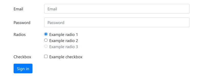
手机端:

22.6.4 水平表单大小
<label>元素添加.col-form-label-lg或.col-form-label-sm类,<input>元素添加.form-control-lg或.form-control-sm类设置较大或较小的水平表单。
1
2
3
4
5
6
7
8
9
10
11
12
13
14
15
16
17
18
19
20
<form>
    <div class="form-group row">
        <label for="email1" class="col-sm-2 col-form-label col-form-label-lg">Email</label>
        <div class="col-sm-10">
            <input id="email1" type="email" class="form-control form-control-lg" placeholder="Large input">
        </div>
    </div>
    <div class="form-group row">
        <label for="email2" class="col-sm-2 col-form-label">Email</label>
        <div class="col-sm-10">
            <input id="email2" type="email" class="form-control" placeholder="Normal input">
        </div>
    </div>
    <div class="form-group row">
        <label for="email3" class="col-sm-2 col-form-label col-form-label-sm">Email</label>
        <div class="col-sm-10">
            <input id="email3" type="email" class="form-control form-control-sm" placeholder="Small input">
        </div>
    </div>
</form>
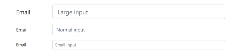
22.6.5 行内表单
<form>元素添加.form-inline类,将所有表单元素显示在同一行。需要手动设置元素之间的水平间距。
1
2
3
4
5
6
7
8
9
10
11
12
13
14
<form class="form-inline">
    <input id="name1" type="text" class="form-control mb-2 mr-sm-2" placeholder="Jane Doe">
    <div class="input-group mb-2 mr-sm-2">
        <div class="input-group-prepend">
            <span class="input-group-text">@</span>
        </div>
        <input id="username1" type="text" class="form-control" placeholder="Username">
    </div>
    <div class="form-check mb-2 mr-sm-2">
        <input id="check1" type="checkbox" class="form-check-input">
        <label for="check1" class="form-check-label">Remember me</label>
    </div>
    <button type="submit" class="btn btn-primary mb-2">Submit</button>
</form>
电脑端:

手机端:
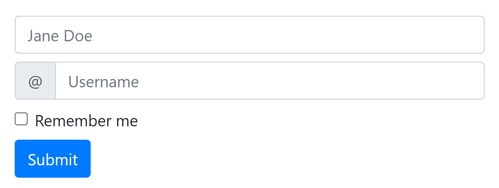
22.7 帮助文本
使用<small>元素加.form-text类显示帮助文本。
1
2
3
4
5
<form>
    <label for="password1">Password</label>
    <input id="password1" type="password" class="form-control">
    <small class="form-text text-muted">Your password must be 8-20 characters long, contain letters and numbers, and must not contain spaces, special characters, or emoji.</small>
</form>
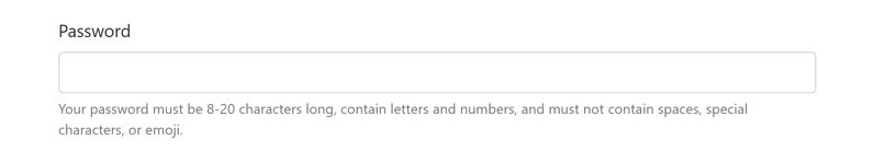
1
2
3
4
5
6
7
<form class="form-inline">
    <div class="form-group">
        <label for="password1">Password</label>
        <input id="password1" type="password" class="form-control mx-sm-2">
        <small class="form-text text-muted">Must be 8-20 characters long.</small>
    </div>
</form>

22.8 表单验证
如果<input>元素指定了required属性,或者输入的内容不符合type属性的要求(例如email格式不正确),则提交表单时浏览器会显示验证失败的信息,阻止提交表单。
22.8.1 浏览器默认样式
1
2
3
4
5
6
7
8
9
10
11
12
13
14
15
16
17
18
19
20
21
22
23
24
25
26
27
28
29
30
31
32
33
34
35
36
37
38
39
40
41
42
<form>
    <div class="form-row">
        <div class="form-group col-sm-4">
            <label for="firstname1">First name</label>
            <input id="firstname1" type="text" class="form-control" placeholder="First name" value="Mark" required>
        </div>
        <div class="form-group col-sm-4">
            <label for="lastname1">Last name</label>
            <input id="lastname1" type="text" class="form-control" placeholder="Last name" value="Otto" required>
        </div>
        <div class="form-group col-sm-4">
            <label for="username1">Username</label>
            <div class="input-group">
                <div class="input-group-prepend">
                    <span class="input-group-text">@</span>
                </div>
                <input id="username1" type="text" class="form-control" placeholder="Username" required>
            </div>
        </div>
    </div>
    <div class="form-row">
        <div class="form-group col-sm-6">
            <label for="city1">City</label>
            <input id="city1" type="text" class="form-control" placeholder="City" required>
        </div>
        <div class="form-group col-sm-3">
            <label for="state1">State</label>
            <input id="state1" type="text" class="form-control" placeholder="State" required>
        </div>
        <div class="form-group col-sm-3">
            <label for="zip1">Zip</label>
            <input id="zip1" type="text" class="form-control" placeholder="Zip" required>
        </div>
    </div>
    <div class="form-group">
        <div class="form-check">
            <input id="chick1" type="checkbox" class="form-check-input" required>
            <label for="chick1" class="form-check-label">Agree to terms and conditions</label>
        </div>
    </div>
    <button type="submit" class="btn btn-primary">Submit</button>
</form>
电脑端:
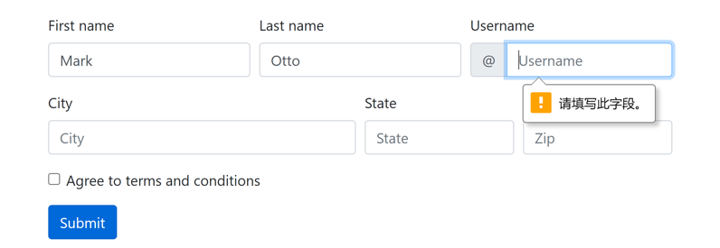
手机端:
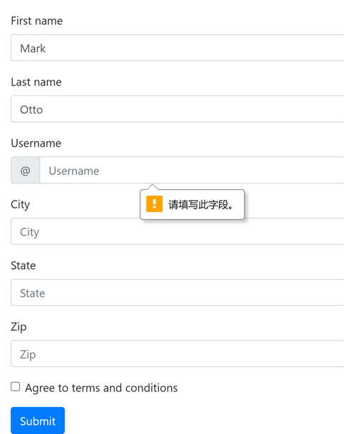
22.8.2 Bootstrap自定义样式
要使用Bootstrap自定义的表单验证样式需要做以下修改:
- 在每个输入元素后增加一个带有
.valid-feedback或.invalid-feedback类的<div>元素,内容为该字段验证成功/失败时要显示的信息。 <form>元素增加novalidate属性和.needs-validation类(自定义,用于添加提交事件监听器)。- 将以下JavaScript代码(使用了jQuery)放在一个
<script>元素中,或写入一个.js文件并通过<script>引入:
1
2
3
4
5
6
7
8
9
10
$(function () {
    $("form.needs-validation").submit(function (event) {
        var form = this
        if (form.checkValidity() == false) {
            event.preventDefault()
            event.stopPropagation()
        }
        form.classList.add('was-validated')
    });
});
1
2
3
4
5
6
7
8
9
10
11
12
13
14
15
16
17
18
19
20
21
22
23
24
25
26
27
28
29
30
31
32
33
34
35
36
37
38
39
40
41
42
43
44
45
46
47
48
49
<form class="needs-validation" novalidate>
    <div class="form-row">
        <div class="form-group col-sm-4">
            <label for="firstname1">First name</label>
            <input id="firstname1" type="text" class="form-control" placeholder="First name" value="Mark" required>
            <div class="valid-feedback">Looks good!</div>
        </div>
        <div class="form-group col-sm-4">
            <label for="lastname1">Last name</label>
            <input id="lastname1" type="text" class="form-control" placeholder="Last name" value="Otto" required>
            <div class="valid-feedback">Looks good!</div>
        </div>
        <div class="form-group col-sm-4">
            <label for="username1">Username</label>
            <div class="input-group">
                <div class="input-group-prepend">
                    <span class="input-group-text">@</span>
                </div>
                <input id="username1" type="text" class="form-control" placeholder="Username" required>
                <div class="invalid-feedback">Please choose a username.</div>
            </div>
        </div>
    </div>
    <div class="form-row">
        <div class="form-group col-sm-6">
            <label for="city1">City</label>
            <input id="city1" type="text" class="form-control" placeholder="City" required>
            <div class="invalid-feedback">Please provide a valid city.</div>
        </div>
        <div class="form-group col-sm-3">
            <label for="state1">State</label>
            <input id="state1" type="text" class="form-control" placeholder="State" required>
            <div class="invalid-feedback">Please provide a valid state.</div>
        </div>
        <div class="form-group col-sm-3">
            <label for="zip1">Zip</label>
            <input id="zip1" type="text" class="form-control" placeholder="Zip" required>
            <div class="invalid-feedback">Please provide a valid zip.</div>
        </div>
    </div>
    <div class="form-group">
        <div class="form-check">
            <input id="chick1" type="checkbox" class="form-check-input" required>
            <label for="chick1" class="form-check-label">Agree to terms and conditions</label>
            <div class="invalid-feedback">You must agree before submitting.</div>
        </div>
    </div>
    <button type="submit" class="btn btn-primary">Submit</button>
</form>
验证失败:
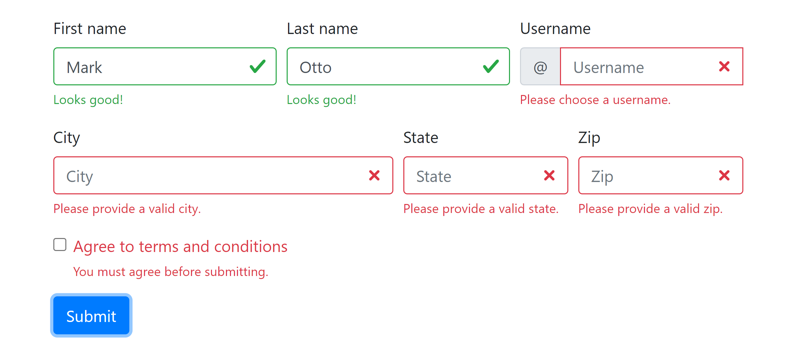
验证成功:
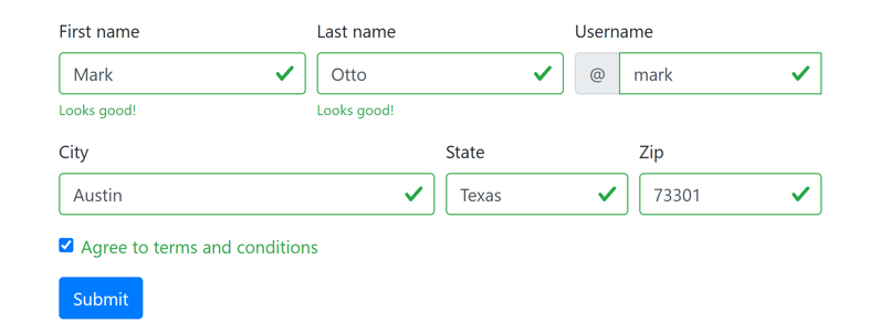
22.8.3 服务端验证
Bootstrap推荐使用上面的客户端验证方式(没有提交表单)。如果需要服务端验证(提交表单,由后端验证),给<input>元素添加.is-valid或.is-invalid类,效果与客户端验证点击提交按钮之后相同。
22.8.4 支持的元素
除了文本输入,单选按钮、复选框、下拉列表、文件上传等元素也支持自定义验证样式。
- 必选的复选框添加
required属性。 - 每组必选一个的单选按钮组内所有单选按钮都添加
required属性(name属性相同的单选按钮视为一组)。
1
2
3
4
5
6
7
8
9
10
11
12
13
14
15
16
17
18
19
20
21
22
23
24
25
26
27
28
29
30
31
32
33
<form class="was-validated">
    <div class="form-group">
        <div class="form-check">
            <input id="check1" type="checkbox" class="form-check-input" required>
            <label for="check1" class="form-check-label">Check this custom checkbox</label>
            <div class="invalid-feedback">Example invalid checkbox feedback</div>
        </div>
    </div>
    <div class="form-group">
        <div class="form-check">
            <input id="radio1" type="radio" name="radio1" class="form-check-input" value="1" required>
            <label for="radio1" class="form-check-label">Toggle this custom radio</label>
        </div>
        <div class="form-check">
            <input id="radio2" type="radio" name="radio1" class="form-check-input" value="2" required>
            <label for="radio2" class="form-check-label">Or toggle this other custom radio</label>
            <div class="invalid-feedback">Example invalid radio feedback</div>
        </div>
    </div>
    <div class="form-group">
        <select class="form-control" required>
            <option value="">Open this select menu</option>
            <option value="1">One</option>
            <option value="2">Two</option>
            <option value="3">Three</option>
        </select>
        <div class="invalid-feedback">Example invalid select feedback</div>
    </div>
    <div class="form-group">
        <input type="file" class="form-control-file" required>
        <div class="invalid-feedback">Example invalid custom file feedback</div>
    </div>
</form>
验证失败:
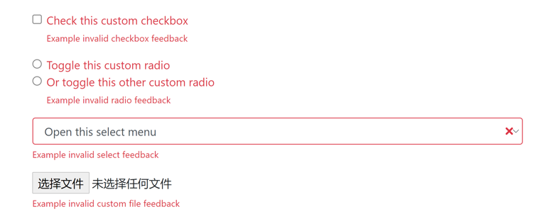
验证成功:
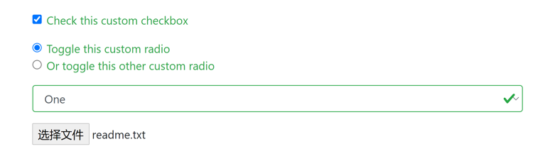
22.8.5 工具提示
可以将.{valid|invalid}-feedback类替换为.{valid|invalid}-tooltip来显示工具提示(tooltip)(气泡)样式的验证反馈信息。
1
2
3
4
5
6
7
8
9
10
11
12
13
14
15
16
17
18
19
20
21
22
23
24
25
26
27
28
29
30
31
32
33
34
35
36
37
38
39
40
41
42
43
44
45
46
47
48
49
<form class="needs-validation" novalidate>
    <div class="form-row">
        <div class="form-group col-sm-4">
            <label for="firstname1">First name</label>
            <input id="firstname1" type="text" class="form-control" placeholder="First name" value="Mark" required>
            <div class="valid-tooltip">Looks good!</div>
        </div>
        <div class="form-group col-sm-4">
            <label for="lastname1">Last name</label>
            <input id="lastname1" type="text" class="form-control" placeholder="Last name" value="Otto" required>
            <div class="valid-tooltip">Looks good!</div>
        </div>
        <div class="form-group col-sm-4">
            <label for="username1">Username</label>
            <div class="input-group">
                <div class="input-group-prepend">
                    <span class="input-group-text">@</span>
                </div>
                <input id="username1" type="text" class="form-control" placeholder="Username" required>
                <div class="invalid-tooltip">Please choose a username.</div>
            </div>
        </div>
    </div>
    <div class="form-row">
        <div class="form-group col-sm-6">
            <label for="city1">City</label>
            <input id="city1" type="text" class="form-control" placeholder="City" required>
            <div class="invalid-tooltip">Please provide a valid city.</div>
        </div>
        <div class="form-group col-sm-3">
            <label for="state1">State</label>
            <input id="state1" type="text" class="form-control" placeholder="State" required>
            <div class="invalid-tooltip">Please provide a valid state.</div>
        </div>
        <div class="form-group col-sm-3">
            <label for="zip1">Zip</label>
            <input id="zip1" type="text" class="form-control" placeholder="Zip" required>
            <div class="invalid-tooltip">Please provide a valid zip.</div>
        </div>
    </div>
    <div class="form-group">
        <div class="form-check">
            <input id="chick1" type="checkbox" class="form-check-input" required>
            <label for="chick1" class="form-check-label">Agree to terms and conditions</label>
            <div class="invalid-tooltip">You must agree before submitting.</div>
        </div>
    </div>
    <button type="submit" class="btn btn-primary">Submit</button>
</form>
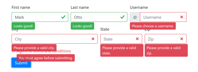
22.9 Bootstrap自定义表单样式
单选按钮、复选框、下拉列表、范围输入和文件上传框这些输入元素除了使用.form-control等类设置样式外,还可以使用.custom-control等类设置Bootstrap自定义的表单样式。
22.9.1 单选按钮和复选框
<input>元素使用.custom-control-input类,<label>元素使用.custom-control-label类,外层<div>元素使用.custom-control加.custom-checkbox或.custom-radio类。
水平排列:给外层<div>元素添加.custom-control-inline类。
1
2
3
4
5
6
7
8
9
10
11
12
13
14
15
16
17
18
19
20
21
22
23
24
25
26
27
<form>
    <div class="custom-control custom-checkbox">
        <input id="check1" type="checkbox" name="check1" class="custom-control-input" value="1">
        <label for="check1" class="custom-control-label">Default checkbox</label>
    </div>
    <div class="custom-control custom-checkbox">
        <input id="check2" type="checkbox" name="check1" class="custom-control-input" value="2" checked>
        <label for="check2" class="custom-control-label">Checked checkbox</label>
    </div>
    <div class="custom-control custom-checkbox">
        <input id="check3" type="checkbox" name="check1" class="custom-control-input" value="3" disabled>
        <label for="check3" class="custom-control-label">Disabled checkbox</label>
    </div>

    <div class="custom-control custom-radio">
        <input id="radio1" type="radio" name="radio1" class="custom-control-input" value="1">
        <label for="radio1" class="custom-control-label">Default radio</label>
    </div>
    <div class="custom-control custom-radio">
        <input id="radio2" type="radio" name="radio1" class="custom-control-input" value="2" checked>
        <label for="radio2" class="custom-control-label">Checked radio</label>
    </div>
    <div class="custom-control custom-radio">
        <input id="radio3" type="radio" name="radio1" class="custom-control-input" value="3" disabled>
        <label for="radio3" class="custom-control-label">Disabled radio</label>
    </div>
</form>
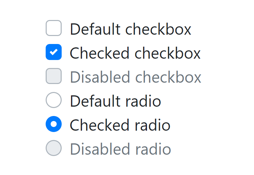
22.9.2 下拉列表
<select>元素使用.custom-select类。可以添加.custom-select-lg或.custom-select-sm类设置大小。
1
2
3
4
5
6
7
8
9
10
11
12
13
14
15
16
17
18
19
20
21
22
23
24
25
26
27
28
29
30
31
32
33
34
<form>
    <div class="form-group">
        <select class="custom-select custom-select-lg">
            <option selected>Open this select menu</option>
            <option>1</option>
            <option>2</option>
            <option>3</option>
        </select>
    </div>
    <div class="form-group">
        <select class="custom-select">
            <option selected>Open this select menu</option>
            <option>1</option>
            <option>2</option>
            <option>3</option>
        </select>
    </div>
    <div class="form-group">
        <select class="custom-select custom-select-sm">
            <option selected>Open this select menu</option>
            <option>1</option>
            <option>2</option>
            <option>3</option>
        </select>
    </div>
    <div class="form-group">
        <select multiple class="custom-select">
            <option selected>Open this select menu</option>
            <option>1</option>
            <option>2</option>
            <option>3</option>
        </select>
    </div>
</form>
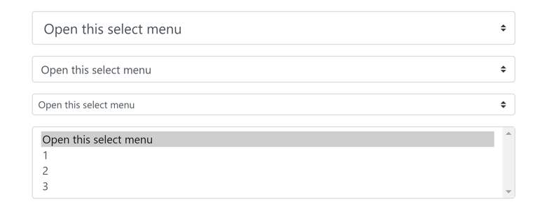
22.9.3 范围输入
<input>元素使用.custom-range类。
1
2
3
4
5
6
7
8
9
10
11
12
13
14
<form>
    <div class="form-group">
        <label for="range1">Custom range</label>
        <input id="range1" type="range" class="custom-range">
    </div>
    <div class="form-group">
        <label for="range2">Custom range (min=0, max=5)</label>
        <input id="range2" type="range" class="custom-range" min="0" max="5">
    </div>
    <div class="form-group">
        <label for="range3">Custom range (min=0, max=5, step=0.5)</label>
        <input id="range3" type="range" class="custom-range" min="0" max="5" step="0.5">
    </div>
</form>
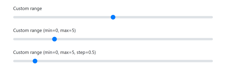
22.9.4 文件上传
<input>元素使用.custom-file-input类,<label>元素使用.custom-file-label类,外层<div>元素使用.custom-file类(缺点是选择了文件后不会显示文件名)。
1
2
3
4
5
6
<form>
    <div class="custom-file">
        <input id="file1" type="file" class="custom-file-input">
        <label for="file1" class="custom-file-label">Choose file</label>
    </div>
</form>

23.轮播
官方文档:https://getbootstrap.com/docs/4.1/components/carousel/
23.1 创建轮播
轮播(carousel)是一个循环展示图片的幻灯片。
1
2
3
4
5
6
7
8
9
10
11
12
13
14
15
16
17
18
19
20
21
22
23
24
25
26
27
28
29
<div id="example-carousel" class="carousel slide" data-ride="carousel">
    <!-- 指示符 -->
    <ol class="carousel-indicators">
        <li class="active" data-target="#example-carousel" data-slide-to="0"></li>
        <li data-target="#example-carousel" data-slide-to="1"></li>
        <li data-target="#example-carousel" data-slide-to="2"></li>
    </ol>

    <!-- 轮播图片 -->
    <div class="carousel-inner">
        <div class="carousel-item active">
            <img src="https://static.runoob.com/images/mix/img_fjords_wide.jpg">
        </div>
        <div class="carousel-item">
            <img src="https://static.runoob.com/images/mix/img_nature_wide.jpg">
        </div>
        <div class="carousel-item">
            <img src="https://static.runoob.com/images/mix/img_mountains_wide.jpg">
        </div>
    </div>

    <!-- 左右切换按钮 -->
    <a href="#example-carousel" class="carousel-control-prev" data-slide="prev">
        <span class="carousel-control-prev-icon"></span>
    </a>
    <a href="#example-carousel" class="carousel-control-next" data-slide="next">
        <span class="carousel-control-next-icon"></span>
    </a>
</div>
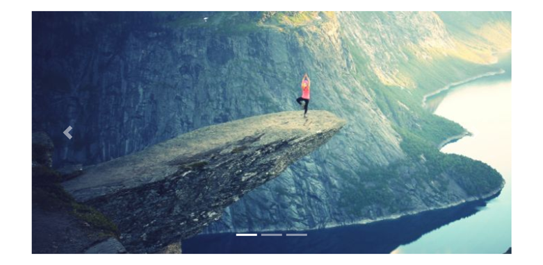
23.2 淡入淡出
最外层<div>元素添加.carousel-fade类设置淡入淡出切换而不是滑动切换。
24.模态框
官方文档:https://getbootstrap.com/docs/4.1/components/modal/
24.1 创建模态框
模态框(modal)是一种网页上弹出的对话框
1
2
3
4
5
6
7
8
9
10
11
12
13
14
15
16
17
18
19
20
21
<!-- Button trigger modal -->
<button type="button" class="btn btn-primary" data-toggle="modal" data-target="#example-modal">Launch demo modal</button>
<!-- Modal -->
<div id="example-modal" class="modal fade">
<div class="modal-dialog">
<div class="modal-content">
<div class="modal-header">
<h5 class="modal-title">Modal title</h5>
<button type="button" class="close" data-dismiss="modal">×</button>
</div>
<div class="modal-body">
<p>Woohoo, you're reading this text in a modal!</p>
</div>
<div class="modal-footer">
<button type="button" class="btn btn-primary">Save changes</button>
<button type="button" class="btn btn-secondary" data-dismiss="modal">Close</button>
</div>
</div>
</div>
</div>
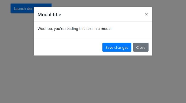
24.2 垂直居中
将.modal-dialog-centered类添加到.modal-dialog实现垂直居中。
24.3 使用网格
.modal-body中嵌套一个.container-fluid,之后就可以使用网格系统。
25.辅助类
Bootstrap辅助类是用于设置HTML元素的style属性的简便形式。
25.1 边框
官方文档:https://getbootstrap.com/docs/4.1/utilities/borders/
| 类 | 描述 |
|---|---|
.border | 全边框 |
.border-top | 上边框 |
.border-bottom | 下边框 |
.border-left | 左边框 |
.border-right | 右边框 |
.border-0 | 无边框 |
.border-top-0 | 无上边框 |
.border-bottom-0 | 无下边框 |
.border-left-0 | 无左边框 |
.border-right-0 | 无右边框 |
.border-{color} | 边框颜色 |
.rounded-circle | 圆角边框 |
25.2 颜色
官方文档:https://getbootstrap.com/docs/4.1/utilities/colors/
见第5节。
25.3 Flex
官方文档:https://getbootstrap.com/docs/4.1/utilities/flex/
Bootstrap 4通过弹性布局(flex)来控制页面的布局。
使用.d-{screen}-flex或.d-{screen}-inline-flex类创建一个flexbox容器,并将其直接子元素转换为flex项目。只有当屏幕宽度大于等于指定的类型时才生效,如果省略则对所有类型的屏幕生效,下同。
注:大部分功能都可以使用网格系统实现,因为.row类设置了display: flex,也是弹性容器。
25.3.1 排列方向
以下类设置flex子元素的排列方向:
.flex-{screen}-row:水平排列.flex-{screen}-row-reverse:水平反向排列.flex-{screen}-column:垂直排列.flex-{screen}-column-reverse:垂直反向排列
25.3.2 对齐方式
.justify-content-{screen}-{align}类设置flex子元素在主轴(对于水平排列是x轴,对于垂直排列是y轴)上的对齐方式。其中align是start(默认), end, center, between, around之一,效果如下:
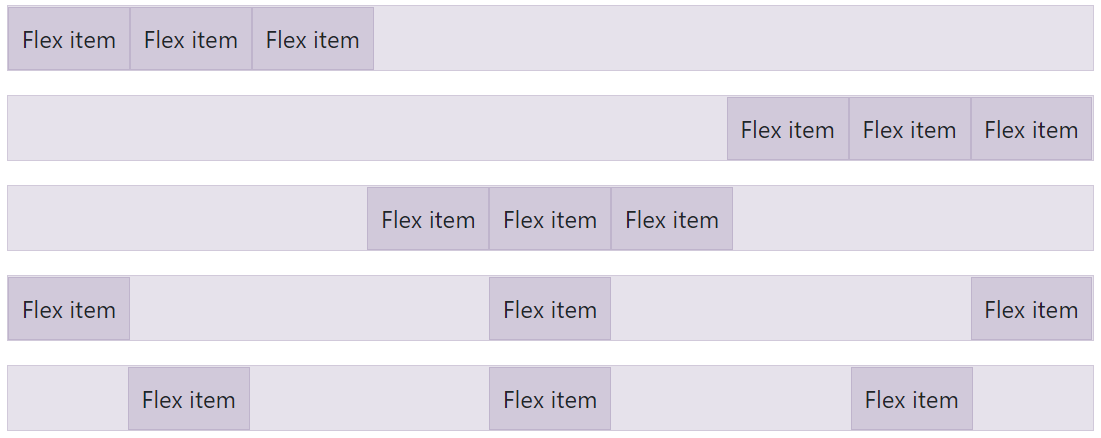
.align-items-{screen}-{align}类设置flex子元素在垂直轴(对于水平排列是y轴,对于垂直排列是x轴)上的对齐方式。其中align是start, end, center, baseline, stretch(默认)之一,效果如下:
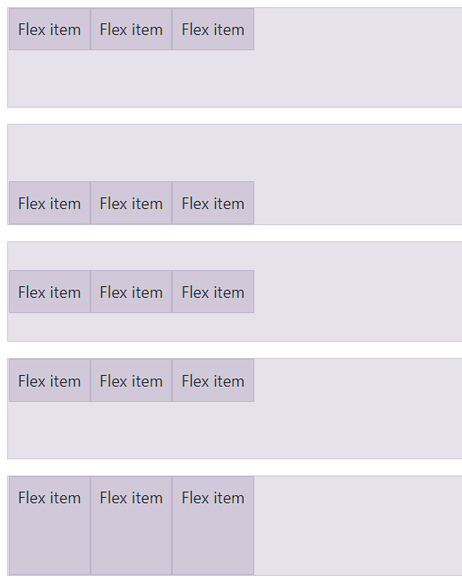
.align-self-{screen}-{align}类设置单个flex子元素在垂直轴(对于水平排列是y轴,对于垂直排列是x轴)上的对齐方式。其中align是start, end, center, baseline, stretch(默认)之一,效果如下:

25.3.3 等宽
.flex-fill类强制设置flex子元素等宽。
25.3.4 增长和收缩
.flex-{screen}-grow-1类设置flex元素尽可能增长,占用所有可用空间。
.flex-{screen}-shrink-1类设置flex元素尽可能收缩。
25.4 间距
官方文档:https://getbootstrap.com/docs/4.1/utilities/spacing/
CSS盒子模型:
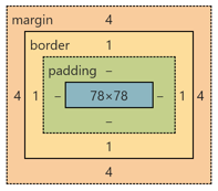
- margin:外间距
- padding:内间距
Bootstrap间距辅助类的命名格式为{property}{sides}-{n}或{property}{sides}-{screen}-{n}。
其中property是下列之一:
m:设置marginp:设置padding
sides是下列之一:
t:上边b:下边l:左边r:右边x:左边和右边y:上边和下边- 空:所有四个边
n是下列之一:
0:间距宽度为0rem1:间距宽度为0.25rem2:间距宽度为0.5rem3:间距宽度为1rem4:间距宽度为1.5rem5:间距宽度为3remauto:间距宽度为auto
screen是下列之一:
sm:小,屏幕宽度≥576pxmd:中,屏幕宽度≥768pxlg:大,屏幕宽度≥992pxxl:超大,屏幕宽度≥1200px
只有当屏幕宽度大于等于指定的类型时该边距类才生效,如果省略则对所有类型的屏幕生效。
例如:
.mr-sm-2类表示当屏幕宽度≥576px时设置style="margin-right: 0.5rem".mx-auto类设置水平居中
25.5 大小
官方文档:https://getbootstrap.com/docs/4.1/utilities/sizing/
w-25, w-50, w-75, w-100, w-auto分别设置宽度为25%, 50%, 75%, 100%, auto。
h-25, h-50, h-75, h-100, h-auto分别设置高度为25%, 50%, 75%, 100%, auto。
25.6 文本
官方文档:https://getbootstrap.com/docs/4.1/utilities/text/
见4.10节。